


The Chartology of The Currency Wars …What If !
Currencies / Forex Trading Oct 29, 2015 - 11:01 AM GMT

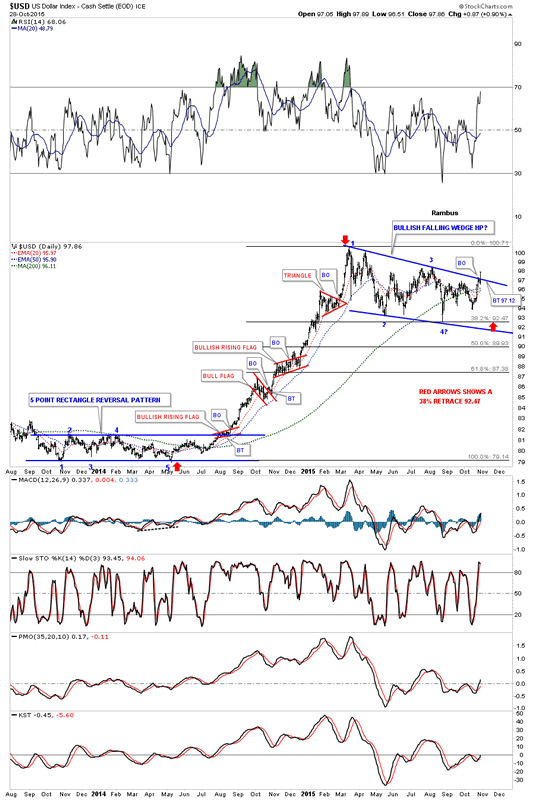
 It finally looks like a major inflection point is getting very close to resolving itself in many different areas of the markets. The US dollar is the key driver of this inflection point which is starting to breakout from a nearly eight month bullish falling wedge consolidation pattern. This afternoon the US dollar began a strong rally that is somewhat unusual during the afternoon hours unless it is Fed Day where anything goes . The daily chart below now shows today’s bar clearly above the top rail of the bullish falling wedge. It’s still possible that we could see a backtest to the top rail at 97.12 before the next impulse move up begins in earnest.
There are some positive developments in regards to the US dollar on the daily chart below. First there are four completed reversal points in the blue bullish falling wedge. This eight month consolidation pattern corrected 38% of the first big impulse leg up as shown by the red arrows. The 20 day ema has just recently crossed above the 50 day ema giving a buy signal. The US dollar is now trading well above its 200 dma which shows the long term nature of this bull market.
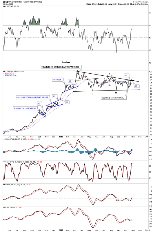
The daily line chart for the US dollar shows some nice Chartology which shows the breakout of the top rail of the black triangle consolidation complete with a small backtest. The breakout also took out the neckline extension rail which had been holding resistance.
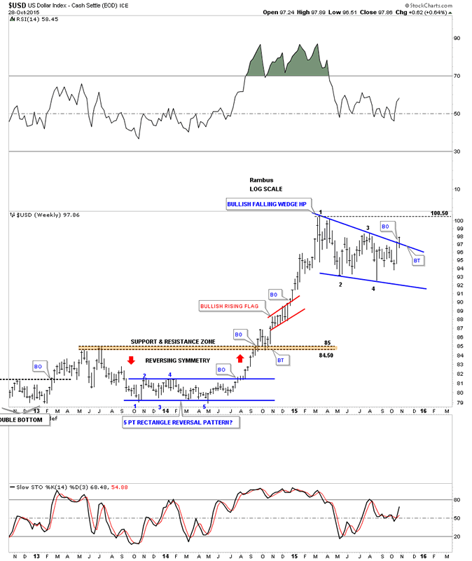
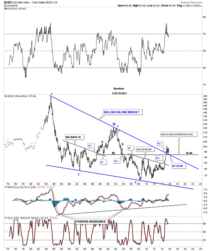
The weekly chart shows the nice big bullish falling wedge which I’m looking at as a halfway pattern to the upside.
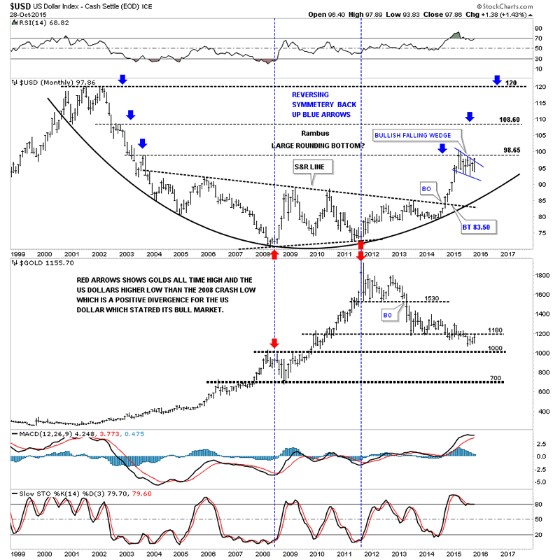
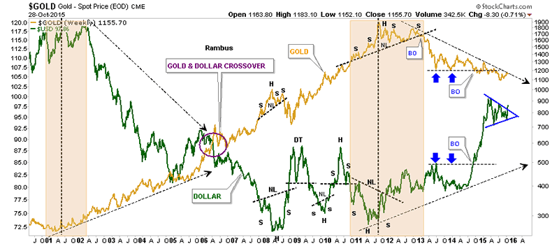
The next chart is a long term combo chart with the US dollar on top and gold on the bottom. The next area of possible resistance could be the 108.60 area which was the high made back in 2002 if the reverse symmetry keeps playing out. Gold has been finding resistance at the S&R line around the 1180 area.
The next long term 30 year monthly chart for the US dollar shows the two fractal bases, big base #1 and big base #2. Big base #1 had enough energy to send the US dollar all the way up to the 120 area before it topped out.
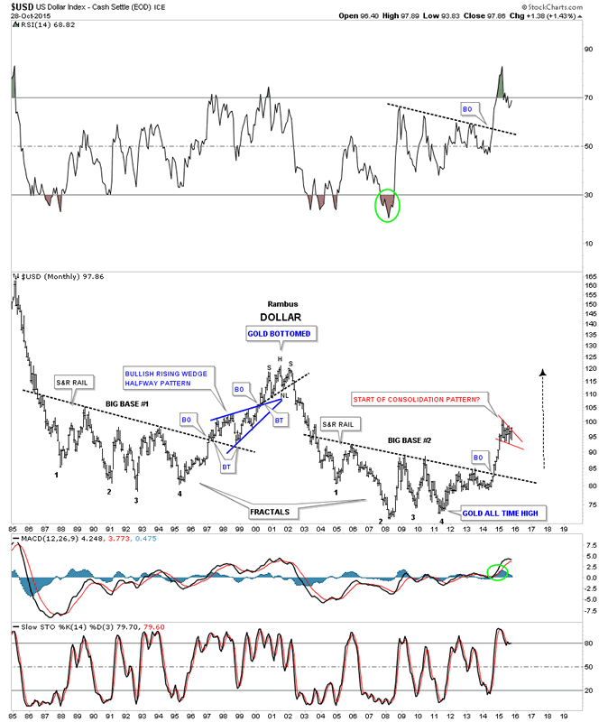
Below is the 40 year chart for the dollar which shows the massive bullish falling wedge which broke out eight months ago. The top rail has held support like a rock during the backtesting process. This is only speculation on my part right now but the price objective of a rising or falling wedge is usually the first reversal point within the wedge itself. Here you can see the first reversal point occurred back in 1985 around the 165 area. Only time will tell us what lies ahead for the US dollar.
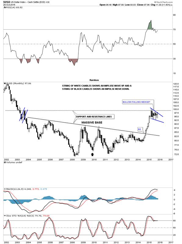
Lets look at one last chart for the US dollar which is the monthly candlestick chart. If the dollar can close out the month on a strong note it will have completed its second white candlestick which will help confirm a possible new impulse move is just beginning.
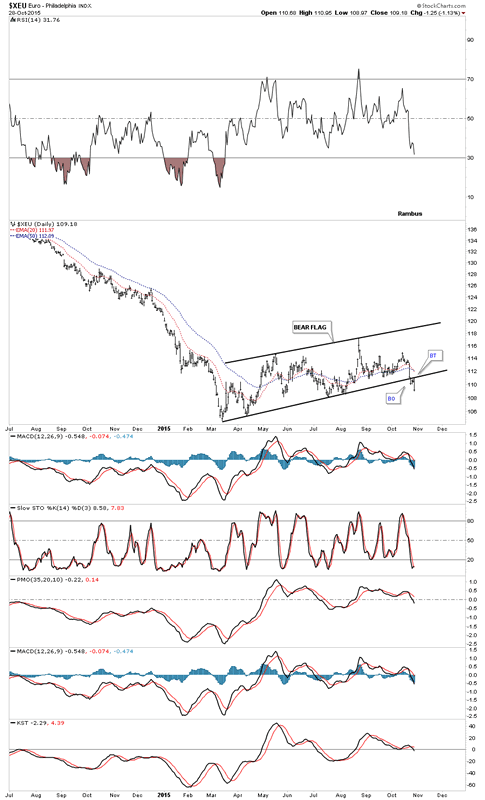
Next lets look at the daily chart for the euro which makes up the biggest chunk of the US dollar. Generally the euro and the US dollar will have similar chart patterns that tend to breakout at the same time. The daily chart below shows the euro breaking down below the bottom rail of the black bear flag in sync with the US dollars breakout of its bullish falling wedge.
The very long term monthly chart below shows how the euro may play out if the red bear flag works out as a halfway pattern in concert with the US dollar’s bullish falling wedge which I showed you earlier on the charts above. As you can see the euro has been in a confined downtrend channel since 2008. I’ve seen many cases when a confined channel breaks there can be an equal channel that forms below it, in this case. If that were to happen the bottom rail of the lower channel would come at the all time lows made back in 2000 at 82.15 or so as shown by the black rectangles used as measuring sticks.
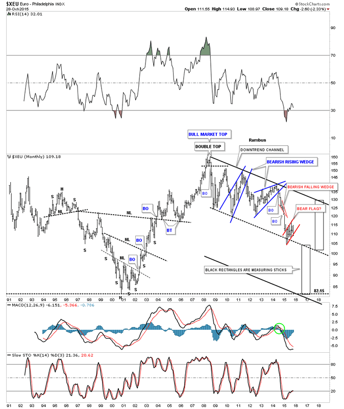
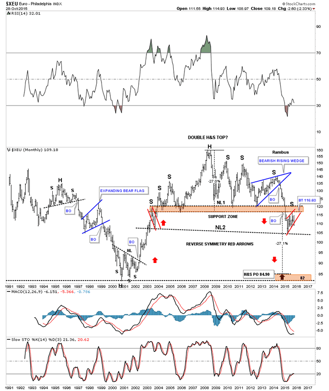
Below is another long term look at the euro which shows a double H&S top in place with the red bear flag being the right shoulder of neckline #2. This massive H&S top has a price objective down to the 84.90 area which is pretty close to its all time low.
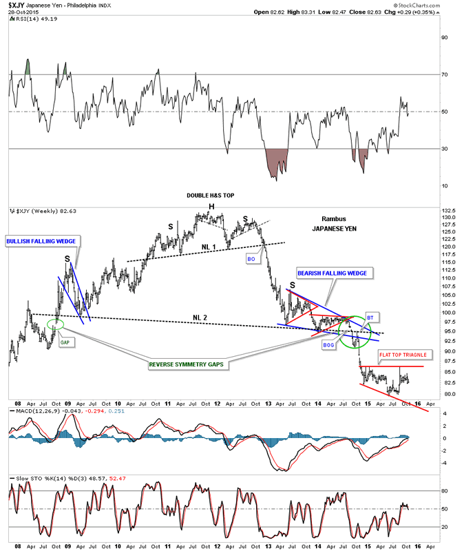
The yen is also an important component of the US dollar. This long term weekly chart shows its massive H&S top we’ve been following very closely since the first red triangle formed inside of the blue bearish falling wedge which created the right shoulder. Since that breakout move from the massive H&S top the yen has been building out the red expanding flat top triangle as its next consolidation pattern.
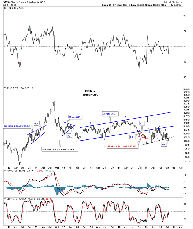
The weekly chart for the $XSF shows it has formed a H&S consolidation pattern just below the bottom rail of the blue bear flag. As you can see the Swiss Franc has broken below its neckline this week.
The weekly chart for the $CAD shows it to has a massive H&S top and is currently trading below its 2009 low after breaking down from a small H&S consolidation pattern.
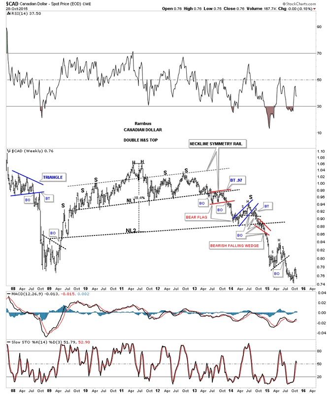
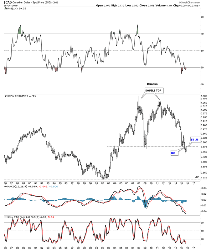
Below is another way to look at the $CAD which shows a huge double top. The price action has broken down below the double bottom trendline and has just recently backtested it from below at .78.
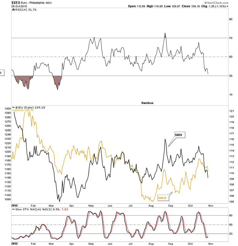
This next chart I have not shown in awhile in which I overlaid gold on top of the $XEU. They tend to move together, in general, so if the $XEU is getting ready to move lower then gold should follow along for the ride, in general.
This last chart for the currencies is a weekly line chart I have not shown in some time but it’s now more relevant than ever. This is a comparison chart in which I overlaid gold on top of the US dollar. As you can the US dollar is breaking out from the blue triangle while gold is hitting resistance at the down slopping arrow. For years I’ve been waiting for these two to finally crossover each other similar to what they did in 2006 but only in the opposite direction.
Before I finish the Wednesday Report I would like to show you a couple of commodities indexes that really took it on the chin the last time the US dollar broke out to the upside. The CRB index broke out of a blue bearish rising wedge last Friday and is attempting to backtest the bottom rail from below. This is a critical backtest taking place right here and now.
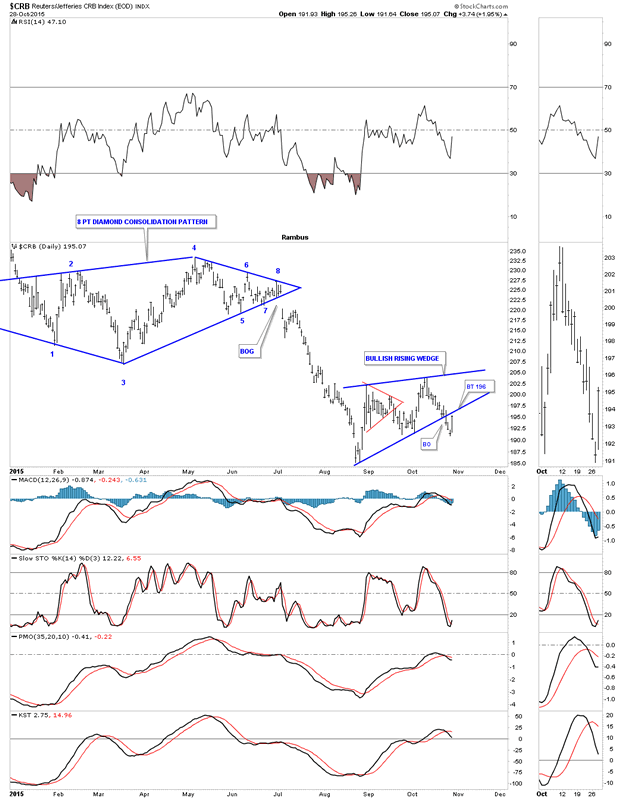
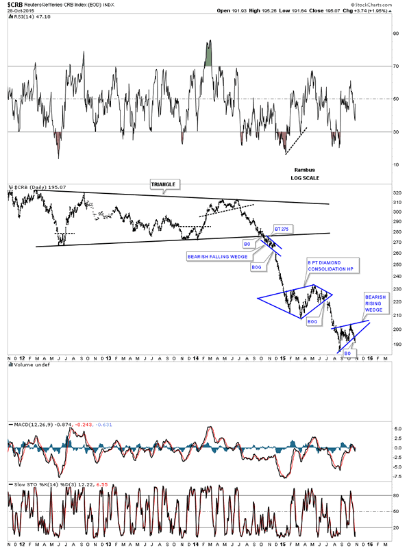
After breaking down from the black triangle reversal pattern the CRB index has been creating one consolidation pattern below the next. You can see how our current bearish rising wedge fits into the bigger picture. Once the backtesting process is finished I expect to see a similar move between the Diamond consolidation pattern and our current bearish rising wedge.
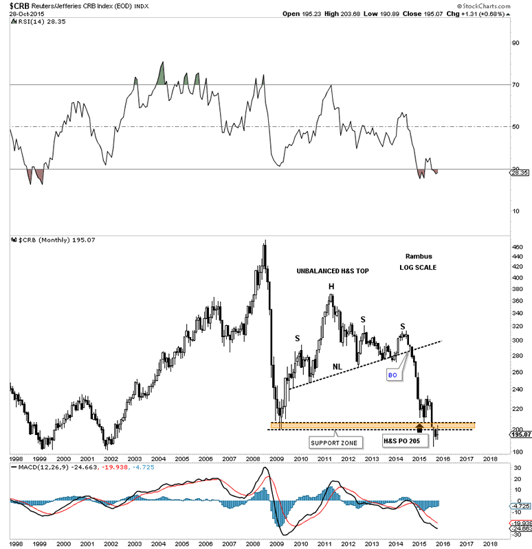
The further we go out in time the more interesting the price action looks. Below is a monthly chart for the CRB index which shows it has reached its H&S price objective at 205. Keep in mind this is a minimum price objective. Note how the price action is trading below the brown shaded S&R zone. This can’t be good if the US dollar is getting ready to breakout to the upside.
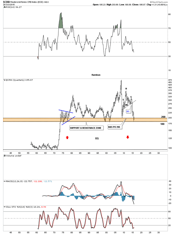
Since I’m running out of time I would like to show you one last chart for the CRB index which I’ve only shown you one time before. Keep in mind when you look at this 60 year chart all the long term currencies charts we looked at above like the euro which shows it has a long ways to fall to reach its price objectives. This is one of those WHAT IF charts. What if the CRB index breaks below the brown shade support and resistance zone? Notice the near vertical move up in the early 1970’s. If the CRB breaks below the brown shaded S&R zone there is not much in the way of support until the all time low is hit under 100 or so. This would be an ideal place to see some reverse symmetry to the downside as show by the red arrows.
These charts above shows you we are really at a very important inflection point that hopefully is getting ready to resolve its self very soon. All the best…Rambus
All the best
Gary (for Rambus Chartology)
FREE TRIAL - http://rambus1.com/?page_id=10
© 2015 Copyright Rambus- All Rights Reserved
Disclaimer: The above is a matter of opinion provided for general information purposes only and is not intended as investment advice. Information and analysis above are derived from sources and utilising methods believed to be reliable, but we cannot accept responsibility for any losses you may incur as a result of this analysis. Individuals should consult with their personal financial advisors.
© 2005-2022 http://www.MarketOracle.co.uk - The Market Oracle is a FREE Daily Financial Markets Analysis & Forecasting online publication.