


Inflation, Commodities and Interest Rates : Paradigm Shifts in Macrotrends
Stock-Markets / Financial Markets 2022 Apr 19, 2022 - 01:54 PM GMT

There are just a few times in ones investing career, depending how early you start and if you survive long enough, that you are witness to some extraordinary changes from the MACRO scale perspective. A few examples would be the beginning of the 1929 crash, the end of the secular bull market that was made in 2000 that began in 1974, the 1987 crash which is still the biggest one day percentage drop in stock market history of 23%. Then there was the banking and housing bubble that collapsed into the 2009 crash low which launched our current secular bull market in the stock markets which is now 13 years old.
Then there are more subtle changes in the macro world that are very rare which most investors or even economist don’t have the ability to recognize until they are well established. Eventually the change of trend is so great that one has to accept the fact and recognize it for what it is. In the beginning of a macro shift few believe it is really happening because the trend has been in place for so long that it seems normal and that is how markets work.
What I would like to show you today are several rare macro events that are going to change the world and in ways we may not understand right now, but changes are coming whether we like it or not. To think one person or a group of people can wave their magic wand and make everything the way it was before are in for a rude awakening. We are just now witnessing the birth of these macro trends that are going to be with us for many years into the future.
It is always hard in the beginning because most people don’t understand the changes and lash out to those in charge thinking they can make things right, but again that is wishful thinking. After a period of time has lapsed there will be an adjustment period and a new norm will be established. For those that understand the macro shifts will do well with their investments, but for those that are unwilling to adapt to the new environment will find it much harder and blame everyone and everything for their underperformance or outright failure.
In the first paragraph of this Report I named a few periods in the stock markets that have become folklore for those that study the history of the markets. There is going to be another date we will add to that list when we look back at this timeframe from the future. The date that will live in infamy is the March 2020 pandemic crash low. That point in time is the demarcation line from one macro trend to another for inflation and interest rates.
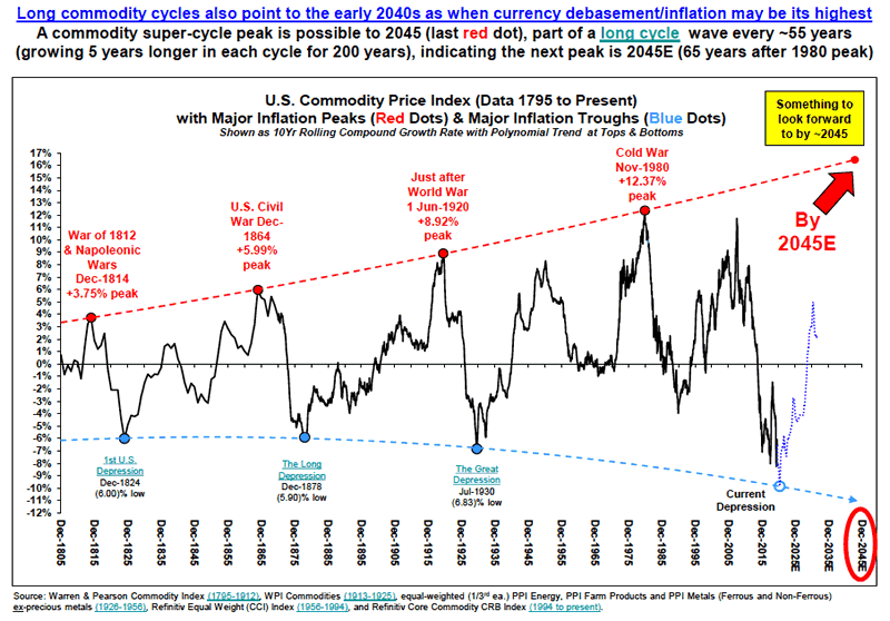
Before we look at my long term charts I would like to show you a couple of graphs which represents periods of inflation with this first graph going all the way back to 1795. The last super cycle peak of inflation ended in 1980 with a secondary peak in 2014 where my long term chart picks up the action that we’ll look at later on. The history of the graph below ended before the March 2020 low but you can see the actual low was close at hand. From cycle peak to cycle peak and growing by five years the next super cycle peak for inflation should be found around the 2045 area if history is any guide.
Below are some of the reasons why inflation is starting to take hold which most of you are already familiar with. There is another reason why inflation is going to be with us for years to come which no one is talking about right now and that is wage inflation and a simple concept to understand. After WW2 the US saw the biggest population growth in its history called the baby boomers. When they entered the workforce many jobs were created in every conceivable area in the economy.
In the 1960’s came the birth control pill that changed dramatically the brith rate for the next generation, the millennials. Now that the baby boomers are retiring in mass numbers, there are not enough workers to fill all the empty positions from the white collar to the blue collar jobs. Employees now have the leverage to ask for a higher wage which employers will have to do to keep their workforce intact. Don’t be surprised to see the immigrant population also rising in the years ahead to help fill many of the open positions that will be available.
China is in big trouble because of its one child policy back in the 1990’s. They have one of the fastest aging population on the planet and will be in much worse shape than the US. The aging demographics of the entire world for the most part is going to help fuel inflation in the future.
There is definitely a lot out there that could provide that Inflationary Shock
A) Global fiscal policy likely remains expansionary until unemployment gets to politically acceptable levels (open ended fiscal QE);
B) De-globalisation leads to higher input costs;
C) A weaker dollar (almost always associated with a rise in inflation expectations);
D) The end of the 12-year downtrend in oil prices;
E) A lot of the disinflationary impact of disruptive technology has been seen (e.g. 32% of UK retail sales are now online);
F) Higher minimum wages in the US ( Biden has a plan for US$15 per hour);
G) Money supply leads inflation by 2.5 years. The Fed (and most central banks) will now also allow inflation to overshoot (unlike in 2011) and will cap bond yields (i.e. finance deficits).
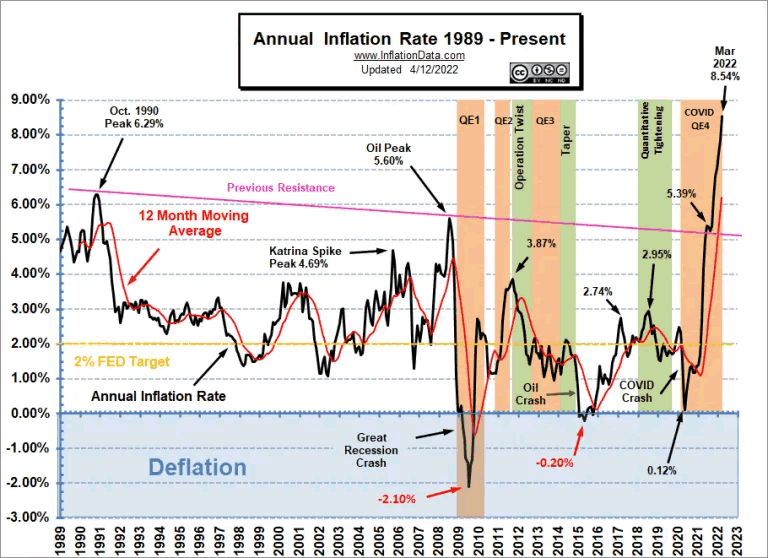
This second graph picks up where the chart above left off showing the beginning of the current round of inflation starting in 2020.
Now I would like to show you from a Chartology perspective some of the long term charts we’ve been following for many years that confirms what the two graphs above are showing.
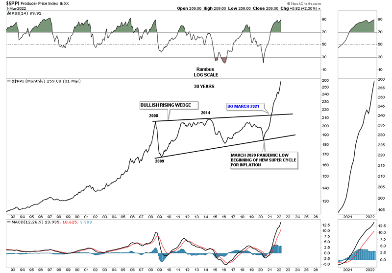
This first chart is a 30 year look at the PPI which basically shows inflation has been part of our history on an ongoing basis. Inflation took a 12 year break between 2008 and the March 2020 low building out the bullish expanding rising wedge. Just one year later in March of 2021 the PPI broke out from that very large bullish expanding rising wedge and hasn’t looked back. Note the last reversal point in that bullish expanding rising wedge was the March 2020 low.
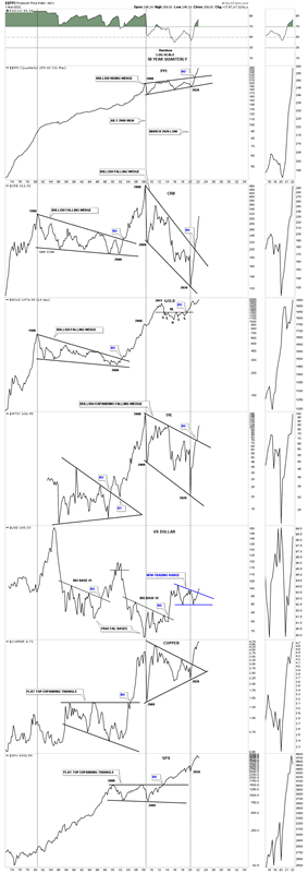
This next long term chart is a combo chart which has the PPI on top with some of the more important commodities below. The black dashed vertical lines show the bottoms in the PPI and how they correspond to the lows made on some of the commodity related charts. Even though the lows are lower lows on the CRB index and oil, the low points match up perfectly on the PPI. As you can see the 2008 low shows up on just about every index and even the 2020 low matches most of the important lows on Copper and the SPX as well at the bottom.
What is also striking about this combo chart is the long drawn out move that Gold and the CRB index had after the parabolic run into their 1980 highs. It took them 20 years to consolidate those massive moves building out a bullish falling wedge. There was a major divergence between Gold and the CRB index in 2008 where just about everything had a major correction including Gold but as you can see compared to the CRB index Gold’s correction was minuscule and hardly shows up and went on to make a new all time high in 2011 on this quarterly line chart.
When looking at the Gold chart it looks like it is in the best shape of all compared to the other commodity indexes as it is trading at a new all time high from this quarterly line chart perspective. Gold could very well be leading the rest of the commodity sectors higher.
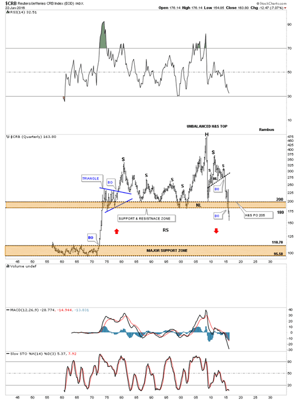
Next I would like to focus in on this long term quarterly chart for the CRB index which I originally built back in 2013 when the H&S consolidation pattern was still under construction. I had always shown the upper brown shaded support and resistance zone as major support through the years but with that H&S consolidation looming I thought there could be a chance that the CRB index could take out that very critical support zone.
What followed next was classic Chartology. When the neckline gave way from that H&S consolidation pattern the price action penetrated the brown shaded S&R zone which showed it was weakening. I’ve shown you many times in the past that when an important area of support or resistance is going to give way we usually see some type of smaller consolidation pattern just above or just below the important S&R line or zone.
This is what I wrote in January of 2016 five years ago.
This last chart for the CRB index is a 60-year quarterly chart which goes all the way back to 1955 so there is a lifetime of history to look at. Up until the early 1970’s the CRB index traded in a very narrow trading band between 110 and 95 or so. Once the price action broke above the top of the lower trading range it was a straight shot up to the beginning of the blue triangle. For over forty years the CRB index traded above the top of the brown shaded S&R zone until fairly recently. Keep in mind this is a quarterly chart which takes three months to complete a bar.
You can call the price action above the brown shaded S&R zone anything you’d like, unbalanced H&S top, double top or anything else that may come to mind. It’s the brown shaded S&R zone which is the most important thing to grasp about this chart. For over 40 years it held support and now it’s broken to the downside. This suggests it should now reverse its role to what had been support to now resistance on any backtest from below.
One last feature on this long-term quarterly chart below is shown by the red arrows. Back in the 1970’s when the CRB index broke out above the lower brown shaded S&R zone it went vertical. I’ve been showing this chart for sometime now which suggests we may see some reverse symmetry back down over the same area as the vertical rally up in the 1970’s. When I first posted this chart the price action was still trading above the brown shaded S&R zone. I’m still amazed when I look at this chart and see the price action trading below the brown shaded S&R zone which is at its lowest point since the 1970’s. How it plays out is going to be interesting to say the least. Back to the future comes to mind.
January 2016.
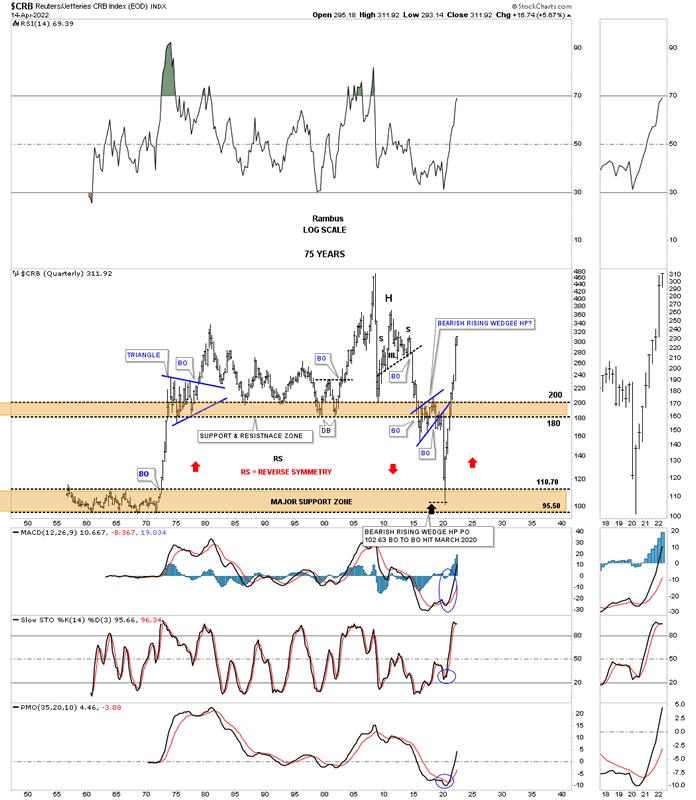
Today April 17th, 2022:
Below is the exact same chart as the one above and shows what happened. As you can see the initial move below the upper brown shaded S&R zone on the chart above was the very beginning of the blue bearish rising wedge which was the small consolidation pattern that I suggested could happen before the CRB index would move lower. The brown shaded S&R zone did in fact reverse its role from what had been support for 40 years then turned into resistance during the formation of the blue bearish rising wedge.
The other major point I made in the 2016 post above was that we could see reverse symmetry to the downside over the same area that was made during that vertical rally in the 1970’s as shown by the red arrows. There is nothing magical about this chart if you understand how Chartology works.
So far our discussion has been about major macro changes that are taking place in inflation, commodities and interest rates. Note where the CRB finally put in its secular bear market low which was down into the lower brown shaded S&R zone in March of 2020 which was the price objective for the blue bearish rising wedge. I have to admit that I didn’t expect to see the initial thrust to the new commodity bull market go up as vertical as it has. I thought we could see some initial resistance back at the upper brown shaded S&R zone but that wasn’t the case.
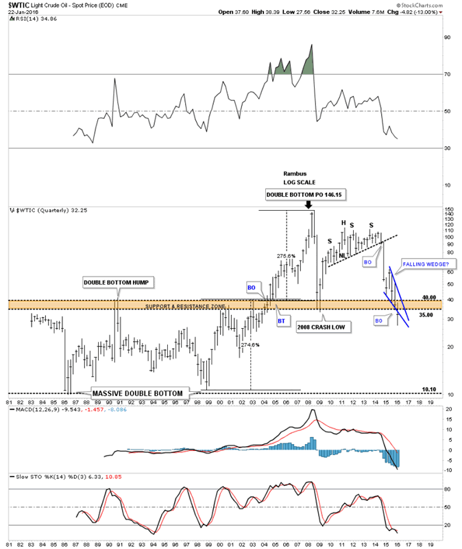
Back in 2013 or so the CRB index wasn’t the only long term quarterly chart I built. I also built one for WTIC oil, which was exhibiting many of the same characteristics of the CRB index which is understandable.
This is what I wrote on January 22, 2016 for WTIC.
Below is a very long-term 35 year chart for oil which shows its huge trading range that lasted from the early 1980’s to the early 2000’s when it finally broke above that massive resistance zone between 35 and 40. Once it broke above that brown shaded S&R zone there was nothing to stop the price action from skyrocketing up to 147 where it finally ran out of gas.
What is interesting about this long-term chart for oil is the trading range between 10 and 40. What that massive trading range measured out to was 146.15 on a percentage basis which was around 275%. You can see how our blue falling wedge has cracked below the upper brown shaded support and resistance zone. The pieces of the puzzle are all there we just have to see the price action do its thing now.
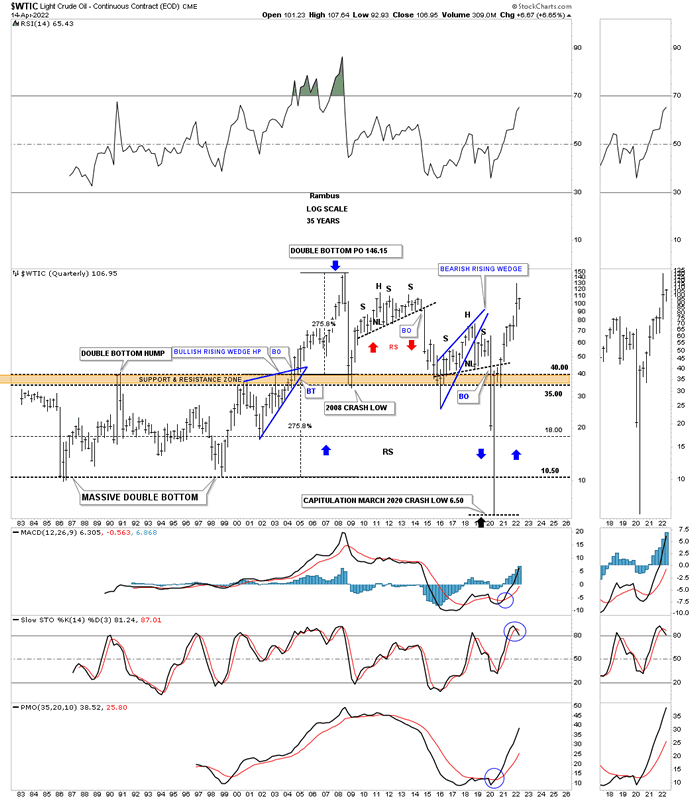
Today April 14th, 2022:
In the case of the WTIC it built out a classic H&S consolidation on top of its brown shaded S&R zone before it gave way to the downside. The classic H&S top started out with the blue bearish rising wedge which is similar to the blue bearish rising wedge the CRB index that formed below its brown shaded S&R zone. The left shoulder and head formed inside of the blue rising wedge with the right shoulder high forming on the backtest to the bottom rail of the bearish rising wedge.
As you can see the WTIC reversed symmetry to the downside making a new all time low in March of 2020 before reversing symmetry back to the upside. The WTIC did show some minor hesitation when it reached the S&R zone from below but it didn’t last very long.
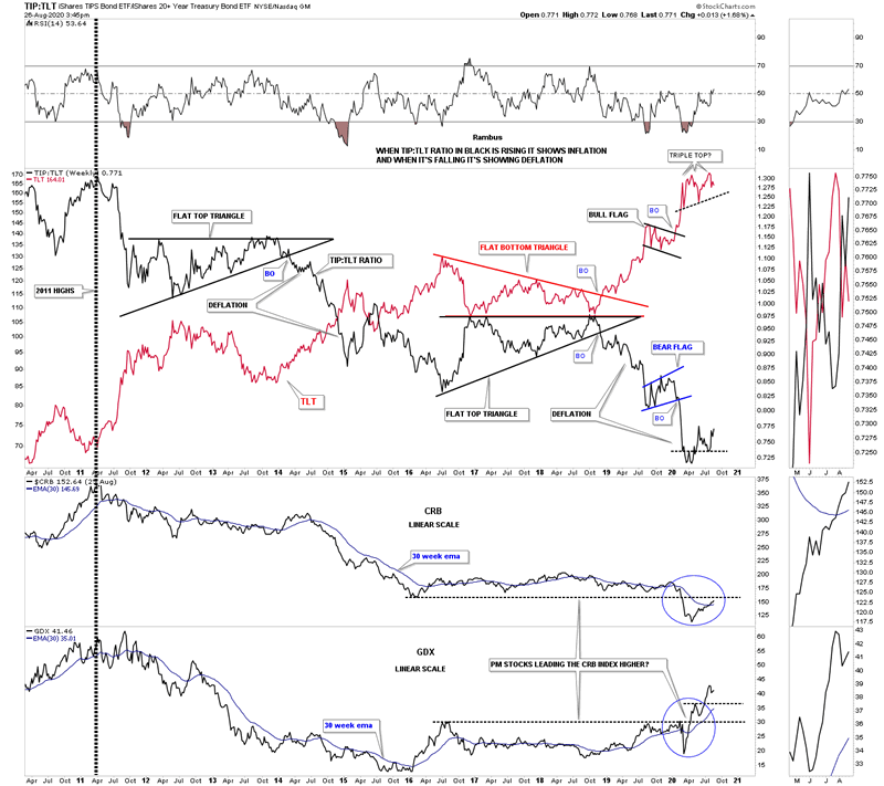
Next is the ratio combo chart that I show you fairly often which I use to gauge the deflation / inflation debate. I use the TIP:TLT ratio in black overlaid on top of the TLT in red to look for signs of which one is in charge. When the TIP:TLT ratio in black is falling that shows signs of deflation and when it is rising inflation has the upper hand. Note the nearly perfect inverse correlation the ratio in black has to the TLT. If you know what the TLT is going to do you can expect to see the ratio do the opposite. Note the possible triple top I labeled back on August 26th, 2020.
Below is what I wrote on August 26, 2020 five months after the March 2020 crash low.
This next chart is another look at the possible inflation – deflation debate. On the top chart I’ve overlaid the TLT on top of black TIP:TLT ratio that shows when the ratio is falling there is deflation which has been the case since the 2011 high. Almost 9 years to the month the ratio in black is trying to put in a small reversal pattern while the TLT in red may be forming a triple top. I also added the CRB and the GDX to the bottom of the chart. As you can see the CRB has been following the black ratio pretty closely over the last 9 years or so as it too is attempting to put in its own bottom and is now trading above its 30 week ema. As you can see the CRB has a test coming up very shortly as the previous low made back in 2016 is coming into focus. The GDX is about 1 year ahead of the CRB and is leading the new commodity bull market higher over the coming years.
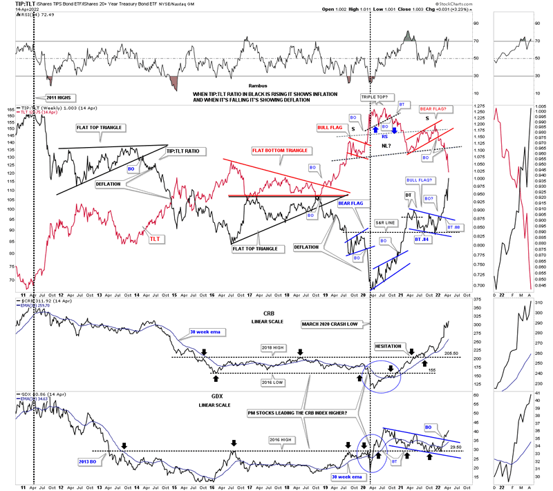
Today April 17th, 2022:
This updated ratio combo chart shows what took place since the post on August 26th of 2020. That little triple top on the red TLT we looked at in August of 2020 ended up being the head of a fairly large H&S top. Note how the TLT in red and the ratio in black are now about to cross each other giving more strength to the ratio and commodities in general.
This chart also shows the CRB index and the GDX at the bottom and how they have reacted to the strength in the black ratio and weakness in the red TLT since the head portion of the H&S top. Note how beautifully the 2016 S&R line has worked since the initial breakdown back in 2013 which held resistance until the price action finally took it out during the March 2020 rally. It then reversed its role back to support on several touches from above. The CRB index also produced its own S&R line which was finally breached to the upside in 2020 with a nice clean breakout and backtest before embarking on its current leg higher. It is hard to see on this chart but the high in 2011 was the beginning of the deflationary weakness going into the March 2020 pandemic crash low which ended that phase of deflation.
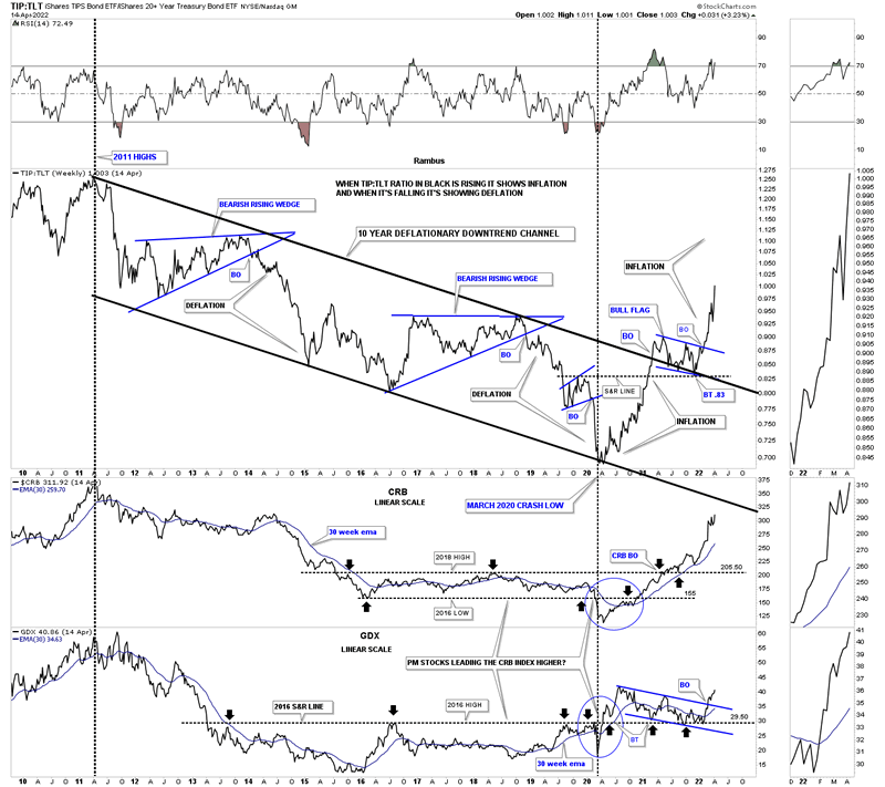
Below is the exact same chart as the one above but I removed the TLT in red so you can see the TIP:TLT ratio much more clearly. The ratio has formed a perfect parallel downtrend channel starting at the 2011 high and ending at the March 2020 low. You can see the two big blue bearish rising wedge consolidation patterns that formed inside of the downtrend channel which showed bouts of deflation.
Note the classic breakout and backtest to the top rail of the 2011 downtrend channel where the ratio formed the small bull flag on top of the upper rail of the downtrend which again is classic Chartology. The last point I would like to make is that the ratio on top and the GDX on the bottom both bottomed in March of 2020 while the CRB index bottomed out one month later in April.
The other important part of the major changes taking place that are going to affect the US and the rest of the world and is still in their infancy is interest rates. Any student of stock market history knows that interest rates can be trend bound for many years before a reversal takes place. Below is a graph I found that goes back 200 years and shows once a major trend develops, either up or down it can last many years.
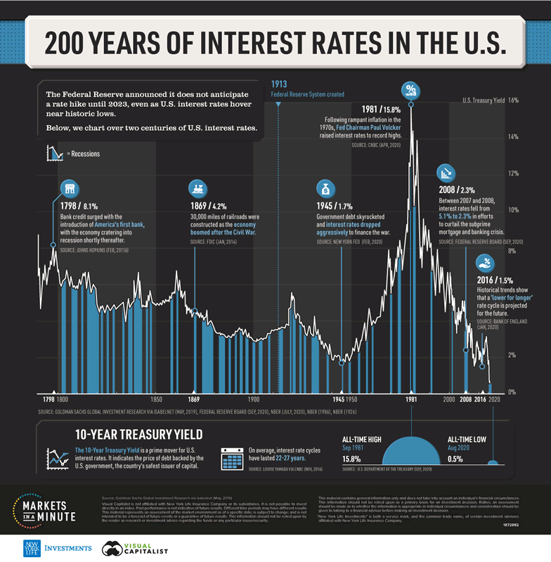
Below is a long term monthly combo chart I’ve shown you through the years which shows the 30 year and ten year bond yields trapped inside of the major downtrend channel since their all time high made in October of 1981. First, notice the H&S top that formed at the end of the last cycle in interest rates in 1981.That downtrend lasted 39 years until March of 2020. The end of a major cycle often ends in a capitulation move, blue arrows, with a vertical move, in this case, to the bottom.
We’ve been following that H&S bottom on another weekly chart for the TNX well before the breakout of its neckline which ensures the 39 year downtrend in interest rates has come to a climatic end even though the top rail hasn’t been broken yet.
It took 39 years to go from 15% in 1981 to 1/2% in March of 2020. What an incredible macro event.
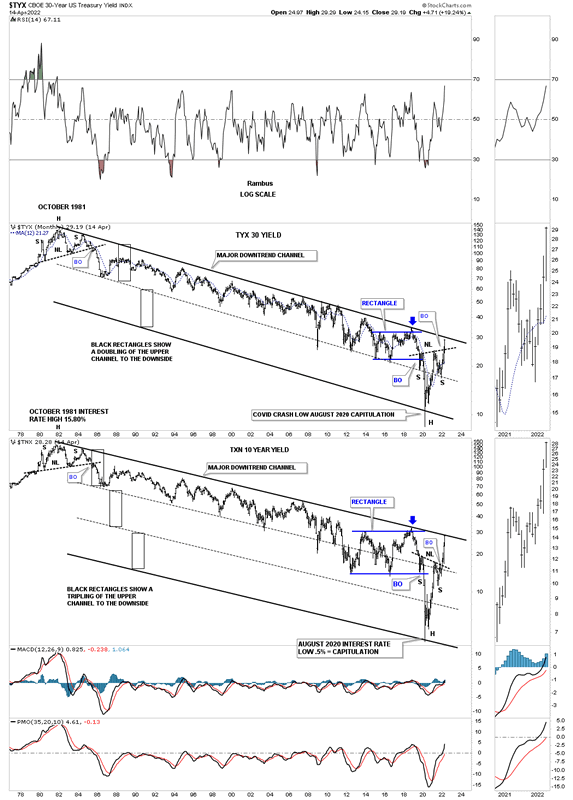
Below is the weekly line chart for the TNX I’ve shown you from time to time which shows a pretty symmetrical H&S bottom, see chart above, with the neckline symmetry line holding support for the right shoulder.
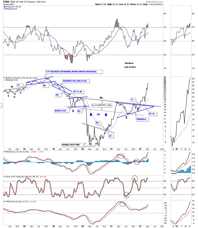
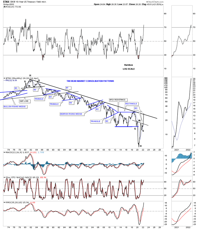
This last chart for the TNX shows all the chart patterns that formed that 39 year decline in interest rates. I hate to keep saying but this chart shows some beautiful Chartology with one consolidation pattern forming below the previous one making lower lows and lower highs all the way down.
I want to leave you with this long term combo chart for the PM complex we’ve been following since the right shoulder low was made a couple of months ago in February. If you don’t believe in the power of long term charts then these charts will mean nothing to you. On the other hand if you think there is something to them then you will be able to take advantage of the MACRO changes that are already taking place. We have only one lifetime to make our fortune and now it looks as good a time as any.
All the best
By Rambus Chartology
FREE TRIAL - http://rambus1.com/?page_id=10
© 2022 Copyright Rambus- All Rights Reserved
Disclaimer: The above is a matter of opinion provided for general information purposes only and is not intended as investment advice. Information and analysis above are derived from sources and utilising methods believed to be reliable, but we cannot accept responsibility for any losses you may incur as a result of this analysis. Individuals should consult with their personal financial advisors.
© 2005-2022 http://www.MarketOracle.co.uk - The Market Oracle is a FREE Daily Financial Markets Analysis & Forecasting online publication.