


Weekly Stock Market Technical Analysis Report
Stock-Markets / Forecasts & Technical Analysis Dec 23, 2006 - 06:32 PM GMTBy: Mike_Burk

The good news is that the Dow Jones Industrial Average (DJIA) and S&P 100 (OEX) closed at all time highs last Tuesday.
Short Term
During an up market the major indices seldom move downward for more than 3 consecutive days.
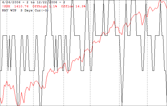
The chart below shows the S&P 500 (SPX) in red and an indicator showing the percentage of the last 3 trading days that have been up. The indicator reaches the top of the screen when there have been 3 consecutive up days and it reaches the bottom of the screen when their have been 3 consecutive down days. The chart covers the past 6 months and has vertical dashed lines drawn on the 1st trading day of each month. The SPX was down the last 3 trading days of last week. The last time that happened was in early November which, like last week, was also a seasonally strong period.
The next chart is like the previous one except it shows the NASDAQ composite (OTC) in red, the indicator has been modified to show the percentage of the past 5 trading days that have been up. As of Friday, the OTC has been down for 5 consecutive days the 1st time since this rally began last July.
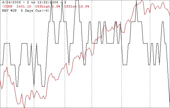
By this measure the market is oversold and due for a short term rally.
Intermediate term
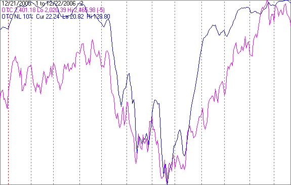
New lows begin to increase as the market approaches a significant top. The chart below covers the past year showing the OTC in magenta and a 10% trend (19 day EMA) of NASDAQ new lows (OTC NL) in blue. OTC NL has been plotted on an inverted Y axis so increasing new lows move the indicator downward (up is good). The indicator is very near the top of the screen suggesting their will be new highs in the index.
Seasonality
Next week includes the last 4 trading days of the year during the 2nd year of the Presidential Cycle. The tables below show the daily performance of the OTC and SPX over that period. OTC data covers the period from 1966 - 2002 and SPX data from 1930 – 2002 during the 2nd year of the Presidential Cycle. There are summaries for both the 2nd year of the Presidential Cycle and all years combined beginning with 1963 for the OTC and 1928 for the SPX.
The OTC has been up about 60% of the time with a modestly positive bias. The SPX has been up nearly 70% of the time. This period during the 2nd year of the Presidential Cycle has been weaker than the average for all years.
Report includes the last 4 days of December.
The number following the year represents its position in the presidential cycle.
The number following the daily return represents the day of the week;
1 = Monday, 2 = Tuesday etc.
| OTC Presidential Year 2 | |||||
| Day4 | Day3 | Day2 | Day1 | Totals | |
| 1966-2 | 0.04% 2 | -0.09% 3 | 0.07% 4 | -0.14% 5 | -0.12% |
| 1970-2 | 0.44% 1 | 0.35% 2 | 0.57% 3 | 0.12% 4 | 1.49% |
| 1974-2 | 0.99% 4 | -0.24% 5 | 0.07% 1 | 1.77% 2 | 2.59% |
| 1978-2 | 0.64% 2 | -0.30% 3 | -0.03% 4 | 0.58% 5 | 0.90% |
| 1982-2 | -0.43% 2 | 0.03% 3 | -0.43% 4 | 0.49% 5 | -0.34% |
| Avg | 0.34% | -0.05% | 0.05% | 0.56% | 0.90% |
| 1986-2 | 0.11% 5 | -0.57% 1 | -0.20% 2 | 0.43% 3 | -0.22% |
| 1990-2 | 0.00% 3 | -0.36% 4 | 0.04% 5 | 0.71% 1 | 0.39% |
| 1994-2 | 0.54% 2 | -0.50% 3 | 0.95% 4 | 0.32% 5 | 1.32% |
| 1998-2 | 0.80% 1 | 0.04% 2 | -0.65% 3 | 1.19% 4 | 1.38% |
| 2002-2 | -0.33% 4 | -1.43% 5 | -0.65% 1 | -0.30% 2 | -2.72% |
| Avg | 0.22% | -0.56% | -0.10% | 0.47% | 0.03% |
| OTC summary for Presidential Year 2 1966 - 2002 | |||||
| Averages | 0.28% | -0.31% | -0.03% | 0.52% | 0.47% |
| % Winners | 70% | 30% | 50% | 80% | 60% |
| OTC summary for all years 1963 - 2005 | |||||
| Averages | 0.18% | 0.19% | 0.26% | 0.36% | 1.04% |
| % Winners | 69% | 52% | 69% | 81% | 76% |
| SPX Presidential Year 2 | |||||
| Day4 | Day3 | Day2 | Day1 | Totals | |
| 1930-2 | -0.61% 6 | -0.27% 1 | 2.31% 2 | 1.86% 3 | 3.29% |
| 1934-2 | 0.11% 4 | 3.75% 5 | 0.32% 6 | 0.64% 1 | 4.81% |
| 1938-2 | 1.18% 3 | 1.94% 4 | 0.08% 5 | 0.53% 6 | 3.73% |
| 1942-2 | -1.13% 1 | 0.00% 2 | 1.14% 3 | 0.10% 4 | 0.12% |
| 1946-2 | -0.13% 5 | 0.20% 6 | -0.33% 1 | 0.86% 2 | 0.59% |
| 1950-2 | 1.91% 3 | 0.39% 4 | 0.25% 5 | -0.10% 6 | 2.45% |
| 1954-2 | 1.03% 2 | 0.87% 3 | 0.00% 4 | 0.67% 5 | 2.57% |
| 1958-2 | 1.29% 3 | 1.16% 1 | 0.35% 2 | 0.51% 3 | 3.31% |
| 1962-2 | 0.62% 3 | -0.14% 4 | 0.05% 5 | 0.22% 1 | 0.75% |
| Avg | 0.94% | 0.50% | 0.06% | 0.43% | 1.94% |
| 1966-2 | -0.58% 2 | -0.48% 3 | -0.30% 4 | -0.05% 5 | -1.41% |
| 1970-2 | 0.53% 1 | 1.09% 2 | 0.21% 3 | -0.13% 4 | 1.69% |
| 1974-2 | 0.84% 4 | -0.44% 5 | 0.03% 1 | 2.08% 2 | 2.51% |
| 1978-2 | 1.26% 2 | -0.88% 3 | -0.39% 4 | -0.18% 5 | -0.20% |
| 1982-2 | -0.99% 2 | 0.33% 3 | -0.64% 4 | 0.22% 5 | -1.08% |
| Avg | 0.21% | -0.08% | -0.22% | 0.39% | 0.30% |
| 1986-2 | 0.07% 5 | -0.91% 1 | -0.53% 2 | -0.49% 3 | -1.87% |
| 1990-2 | 0.29% 3 | -0.77% 4 | 0.13% 5 | 0.46% 1 | 0.10% |
| 1994-2 | 0.57% 2 | -0.35% 3 | 0.07% 4 | -0.41% 5 | -0.12% |
| 1998-2 | -0.07% 1 | 1.33% 2 | -0.80% 3 | -0.22% 4 | 0.25% |
| 2002-2 | -0.31% 4 | -1.60% 5 | 0.46% 1 | 0.05% 2 | -1.41% |
| Avg | 0.11% | -0.46% | -0.13% | -0.12% | -0.61% |
| SPX summary for Presidential Year 2 1930 - 2002 | |||||
| Averages | 0.31% | 0.27% | 0.13% | 0.35% | 1.06% |
| % Winners | 63% | 47% | 63% | 63% | 68% |
| SPX summary for all years 1928 - 2005 | |||||
| Averages | 0.13% | 0.34% | 0.48% | 0.21% | 1.15% |
| % Winners | 62% | 61% | 76% | 67% | 79% |
Next Year
- Next year is the 3rd year in the 4 year Presidential Cycle and, on average, the strongest by a wide margin.
- Since 1963 the OTC has been up every 3rd year except 1987. The average gain for the 3rd year has been 36.5%, nearly 3 times the average gain of all years combined.
- Since 1928 the SPX has been up every 3rd year except 1931 and 1939. The average gain has been 15.5%, a little over double its average gain of all years combined.
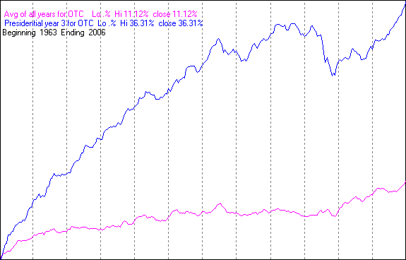
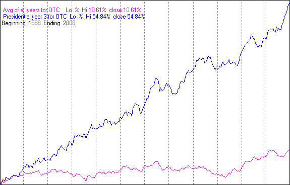
The first chart shows the average performance of the OTC over all years since 1963 in magenta and the average performance during the 2nd year of the Presidential Cycle in blue. The numbers in the legend show the lowest low measured from the beginning of the year followed by the highest high. The last number close is the average return over the year. The last line shows the period covered.
Year 3 includes the crash of 1987 which distorts the charts a little.
There has been a change in the pattern since 1987.
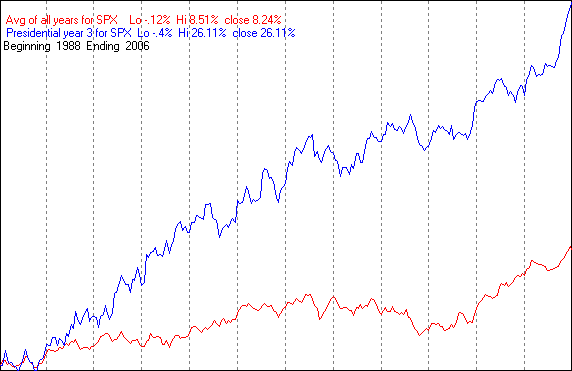
The chart below is similar to the one above except it begins with 1988.
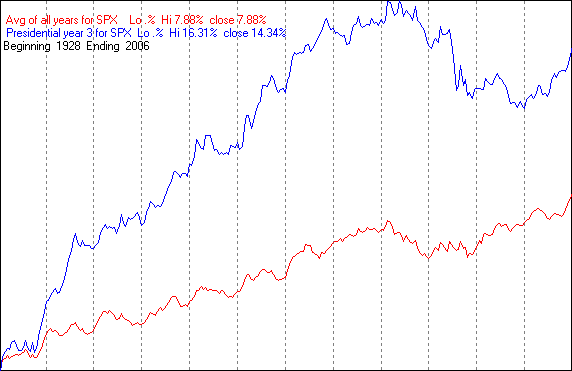
The following charts are similar to those above except they show the SPX average over all years in red and the average during the 3rd year of the Presidential Cycle in blue.
The first chart covers the period from 1928 through 2006.
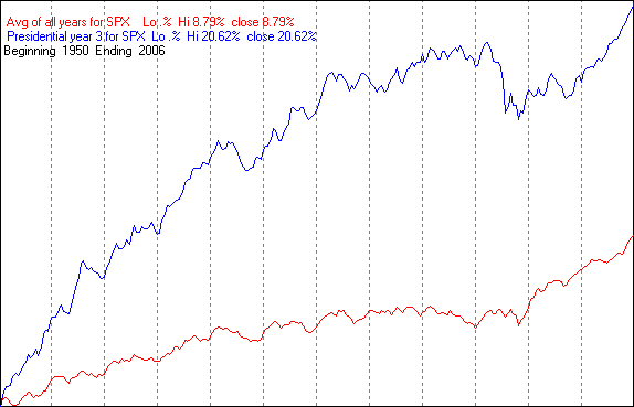
The next chart begins with 1950 and runs through 2006. Average performance over all years is nearly unchanged, but average return during the 3rd year increased from 14.34% to 20.62%.
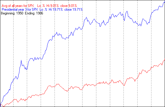
The next chart covers the period from 1950 through 1986 to exclude the 1987 crash. The pattern is a little different, but the average returns were similar.
The next chart covers the period from 1988 through 2006. The average return over all years has been only slightly higher than all other periods, however the average return during the 3rd year of the Presidential Cycle jumped nearly a third to 26.11%. The average return during the 3rd year of the Presidential Cycle has been increasing to where it has represented a lions share of the total return of the 4 year cycle.
2006 followed the average seasonal pattern pretty well for the 1st half of the year.
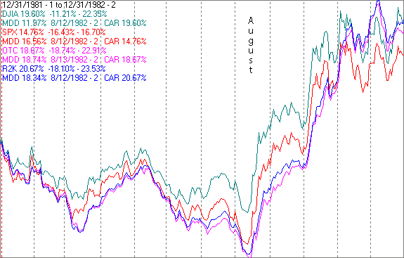
The average pattern for Year 2 of the Presidential Cycle is for the market start a strong rally following a mid October low and continuing for the 1st half of the 3rd year. This year the rally began in mid July, 3 months early. The last time we saw a similar pattern was in 1982. The next chart shows the DJIA, SPX, OTC and Russell 2000 (R2K) on semi log scales over CY 1982.
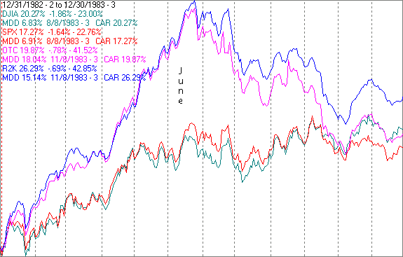
In 1983 the rally continued with the OTC and R2K showing gains of over 40% at their highs in mid June. Gains for the SPX and DJIA were around 23% for the same period.
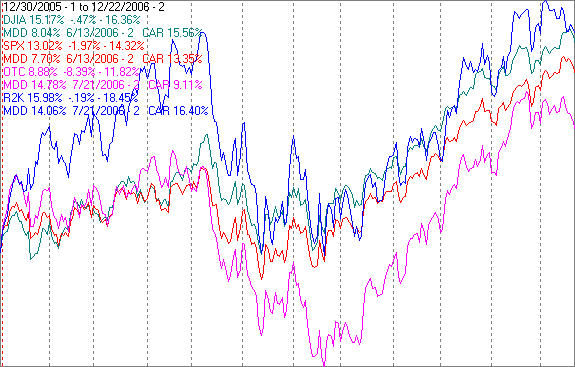
The next chart shows the same indices for the current year to date.
Gains have been a little less than they were in 1982, but close.
There is hope for at least the 1st half of next year.
Conclusion
The market is oversold and the coming week typically has a modest upward bias on low volume. I expect the major indices to be higher on Friday December 29 than they were on Friday December 22.
Last week's positive forecast based on bottoming short term indicators was a miss.
By Mike Burke
Mike Burk is an employee and principle of Alpha Investment Management (Alpha) a registered investment advisor. Charts and figures presented herein are believed to be reliable but we cannot attest to their accuracy. The views expressed are provided for information purposes only and should not be construed in any way as investment advice. Furthermore, the opinions expressed may change without notice. To subscribe to this report : http://alphaim.net/signup.html
NOTE - From time to time, The Market Oracle publishes articles from third parties. These articles do not necessarily express the viewpoints of The Market Oracle or its editorial team.© 2005-2022 http://www.MarketOracle.co.uk - The Market Oracle is a FREE Daily Financial Markets Analysis & Forecasting online publication.