


GDM and GDXJ Gold Stocks In-depth Look
Commodities / Gold and Silver Stocks 2014 Jul 28, 2014 - 01:07 PM GMT

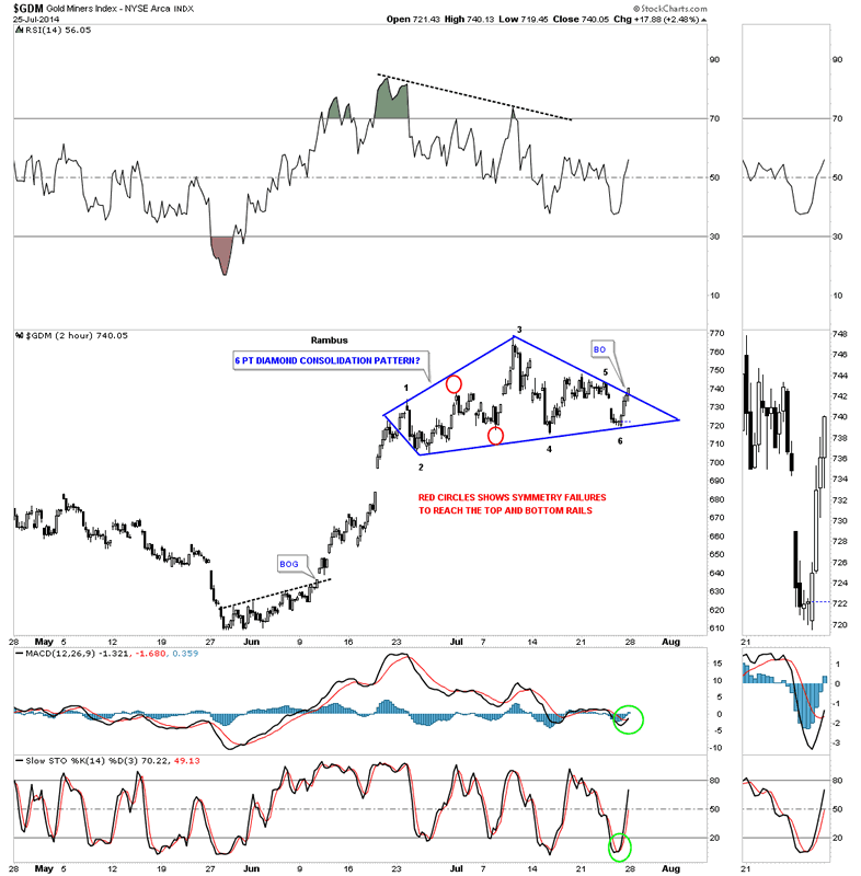
 In this Report I would like to show you an in-depth look at two important precious metals stock indexes, the GDM and GDXJ. The reason I want to show you these two PM stock indexes is because they correspond with the 3 X leveraged etf's, GDM for NUGT and the GDXJ for JUNG that we are currently trading. Last week seemed like the end of the world to a lot of the gold bugs as the PM complex had a decent sell off causing much pain for those holding on the long side. If you've been in the markets for any length of time you know there usually no gain without some pain. It just goes with the territory. We'll look at the very short term to the long term charts, looking for clues that may shed some light on the future direction for the precious metals complex, at least for the short to intermediate term horizons. Lets start with the 2 hour look at GDM that is showing a some what unconventional consolidation pattern, a six point Diamond.
Normally when an area of congestion is taking place and there are no obvious consolidation patterns forming I begin to look at the more obscured patterns such as a Diamond or a Roof pattern. When a Diamond is forming there is usually a big decline in the middle of the pattern that generally expands on the left side and contacts on the right side. As you can see on the 2 hour chart below reversal points #1 and #2 are start the expansion. Reversal points #3 and #4 show the longest point in the Diamond with reversal points #5 and #6 contracting like a triangle. The price action actually broke above the top trendline on the right side of the chart late in the day on Friday. You can see the indicators on the right side of the chart are all in bullish configuration in this 2 hour chart.
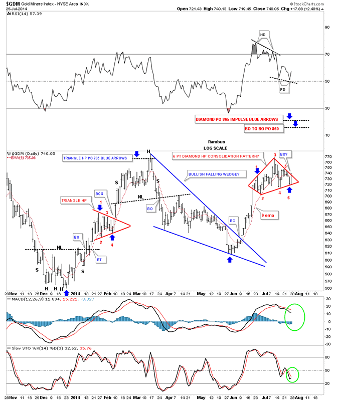
The daily chart puts our little Diamond in perspective in the bigger picture. This chart starts at the December 2013 low and it also shows a higher low made last month in June. This is the start of an uptrend. In order to create an uptrend we'll need to see GDM take out the March highs creating the first higher high. Right now I'm viewing our Diamond as a halfway pattern that is forming off the June low similar to the little red triangle that formed during the December to March impulse move as measured by the blue arrows. I've put two possible price objectives based on the two different measuring techniques I use. Both measurements are very close to each other at 860 for the breakout to breakout method and 865 for the impulse method. One last note on this daily chart for GDM. You may have noticed there was a negative divergence on the RSI when the high was put in on the Diamond several weeks ago. This started the actual correction. Now notice the positive divergence on the RSI. In strong impulse move one likes to see the RSI stay above the 40 area during a correction. So far the RSI has held above 50 which positive.
The weekly chart for GDM shows our inverse H&S bottom that has been in backtest mode for three weeks now after breaking above the neckline. These backtests can sometimes be painful but they are a necessary evil which helps you confirm the breakout. As you can see GDM has been trading above the neckline for three weeks now helping to confirm the breakout is for real. The neckline is now our line in the sand, below is bearish and above is bullish.
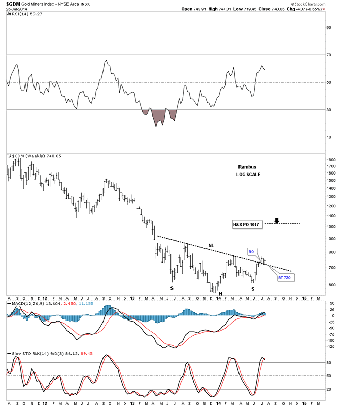
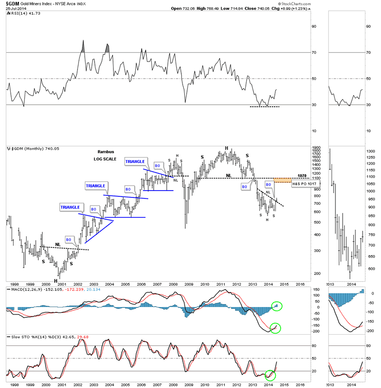
Now for the monthly chart that shows the entire bull market along with the massive H&S top that has led to our current low. When you look at this long term chart notice how each important top and bottom were accompanied by a H&S pattern. Even the 2008 crash low had an inverse H&S bottom but the bounce was too steep to show up on this monthly chart. If our current inverse H&S bottom plays out it will have a price objective up to the 1017 area which is getting close to the most important resistance point on the chart. The brown shaded area shows the price objective of our inverse H&S bottom and the neckline for that massive H&S top which will act as resistance on the initial hit. If the PM complex is actually embarking on the next leg up to new highs I would expect GDM to form some kind of consolidation pattern just below the big H&S top neckline before the price moves higher. On the other hand the old neckline may be too much resistance to overcome and the GDM retreats back down to the precious low or lower. The bottom line is that this inverse H&S bottom is telling us that GDM should have an intermediate term rally that should take the price back up toward the old neckline. From that point we'll have to see how it interacts with the neckline and take it from there. Note the positive indicator on the sidebar.
Now that we've looked at the big cap PM stocks lets take a look at the GDXJ that will show us how the small caps are doing. As you know the small caps have been leading this rally which is a positive as it shows speculative money is finding its way into the more riskier PM stocks. It looks like GDXJ has formed a blue falling wedge which didn't really show itself until late in the day on Friday. We need to see it breakout above the top rail to really put the falling wedge into the bullish category. You can see an A B C correction within the blue falling wedge that just missed the bottom target by a hair. It's possible we get another reversal back down to the bottom rail before this pattern is complete. As long as the price action stays within the confines of the falling wedge it should remain bullish.
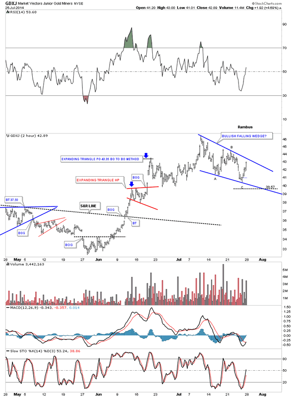
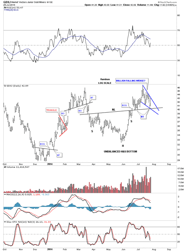
This is the first time I've shown you this daily chart for the GDXJ as I was waiting to see if the second backtest would hold support. First, notice the unbalanced H&S bottom that has a much bigger left shoulder than the right. Sometimes this happens in fast moving conditions. Note the nice breakout gap and two quick backtest to the neckline before GDXJ moved higher. What I really like about this setup is how the blue falling wedge has formed on top of the neckline. I've shown you many times in the past, when you have a very important trendline, many times you will see a small consolidation pattern form just below, right on top or just above that support and resistance line. As you can see the GDXJ actually put in a slightly higher high before it began to correct. Again, we have an important line in the sand, above the neckline is bullish and below is bearish.
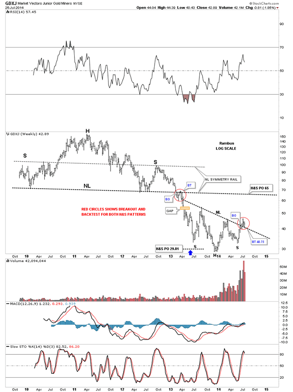
The weekly chart for GDXJ shows the slanted inverse H&S bottom that broke out about three weeks ago. Last week we seen another weekly bar backtesting the neckline which to the untrained eye can seem like the end of the world if you don't have a game play to follow. As I showed you in last weeks, Weekend Report, that another backtest to the neckline was very possible and I gave you specific price targets to watch for. So far the backtesting to the necklines has been textbook. I've put a red circle around the breakout and backtest that took place when the massive H&S top neckline finally gave way and the bear market really got underway. What's so interesting about the current inverse H&S bottom for the GDXJ is it has a price objective up to the neckline of its major H&S top around the 65 area. It's one step at a time. If this inverse H&S bottom plays out according to the Chartology I've laid out for you we should see a the old neckline act as resistance on the initial hit. From that point we'll have to see what takes place and go from there.
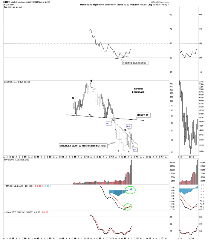
The monthly chart for the GDXJ shows the total history for this PM small cap index. You can see all the indicators are positive along with a positive divergence on the RSI indicator at the top of the chart. The GDXJ is really coming into its own as volume continues to grow exponentially.
These two very important PM stock indexes gives us a good feel for the precious metals complex as a whole. We have some really good lines in the sand to exit our positions if things don't work out as expected. There are no absolutes in the markets so we have to go with the odds, and right now from a Chartolgy perspective, the odds are favoring a move higher in the intermediate term. So watch the necklines for major support and take it from there.
All the best
Gary (for Rambus Chartology)
FREE TRIAL - http://rambus1.com/?page_id=10
© 2014 Copyright Rambus- All Rights Reserved
Disclaimer: The above is a matter of opinion provided for general information purposes only and is not intended as investment advice. Information and analysis above are derived from sources and utilising methods believed to be reliable, but we cannot accept responsibility for any losses you may incur as a result of this analysis. Individuals should consult with their personal financial advisors.
© 2005-2022 http://www.MarketOracle.co.uk - The Market Oracle is a FREE Daily Financial Markets Analysis & Forecasting online publication.