


Dow Support and Resistance Lines
Stock-Markets / Technical Analysis Jun 08, 2008 - 03:22 PM GMTBy: Mick_Phoenix
 Welcome to the Weekly Report. This week we look at some charts, re-introduce you to a way of calling market tops and have a look at what the Russians are saying.
First up are some charts. An Occasional Letter From The Collection Agency subscribers get a week ahead call on the Dow, FTSE and Gold as well as the occasional share that I think has some interesting opportunities. They also receive the Weekly Report and every so often, an occasional letter. Not bad for $20 a Quarter considering the rest of the site is free with many useful links and charts. New uses for a rather good proprietary indicator are sought and after some back testing are introduced to the site. This week I want to share the new hourly Dow indicator, which is still experimental but worth a look.
The indicator highlights support and resistance levels that adjust to a median price of the Dow, I use it in conjunction with traditional support and resistance levels and chart patterns. There is also a moving average that I believe helps to pinpoint shorter term trades. I subscribe to the simple rule that support is support and resistance is resistance. They normally do what they are meant to. Occasionally they don't and we can be alert for those possibilities but in the main, we look to play it straight.
How does it work? Simple, we look at the trend. The green line is the median, the neutral point. The blue and red lines are the proprietary indicator levels of support and resistance. The purple lines are traditional support and resistance levels, the thicker the line the more important the level. The Williams % indicator is used to spot divergences between price and the W% to help identify old, "tired" trends. For "scalpers" on the hourly chart, the red MA helps with shorter term changes in trend.
Here is the Dow hourly February - mid April 2008:
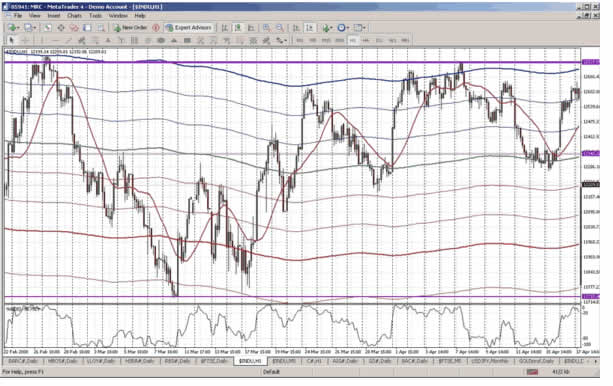
As you can see the chart finishes with the hourly price at support (second blue line up from the green median) after an uptrend move of over 200 points. So what happened next? Did support break and the up move reverse or did support allow for a new base for a move higher?
And here is mid April to current:
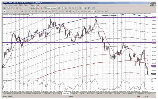
Looking at the left side of the chart, that 2nd blue line up from the green median was resistance, it broke, became support and the uptrend continued. That blue line then remained support until 30th April, although braver traders who held until the close of the candle may have stayed long. The trade exit at the 30th April would have netted 250+ pts. However, if you played the move looking to exit at the next resistance attempt (close up view):
you would have netted circa 280 pts as the spike up open and move higher petered out the next trading day. Either trade was good.
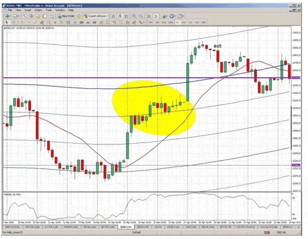
Why did I highlight this trade instead of the more eye-catching move up from the green median line and traditional support level at 12350ish? Well, firstly it was only a tentative support level at 12350 and secondly it was a basing move that lasted over 2 trading days, the real move up was the opening spike on the 16th, most would have missed it. Taking the long, in an already established uptrend, later in the day on the 16th when resistance was broken is more realistic.
Taking us back to the current price and we have a nice set up, here is a close up:
Our tentative traditional support at 12350-ish (thin purple line) that we saw back in April came into play in early June. Of more interest right now is where the Dow closed on Friday, right at a prop'y indicator support level. My long suffering subscribers will get my thoughts for next week but as you can see we could be in for a very simple to call move.
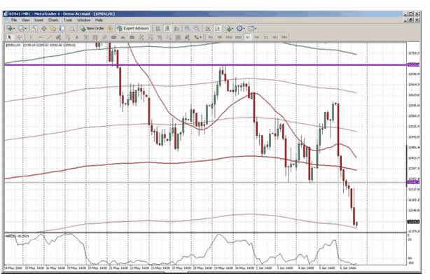
Remember though, the hourly Dow prop'y indicator is experimental, the daily version is pointing to a different possible scenario.
18 months ago I wrote an article that showed a set up, discovered by Dan Basch, which helped to show when markets are topping. It has served me well over the intervening period. Now another set up has appeared. Dan used an example of the Nikkei to show the set up. Whilst he uses diamond formations in his example, I do not purely because I don't like them. However, the rest of the chart is a beauty. Here is the chart Dan used:
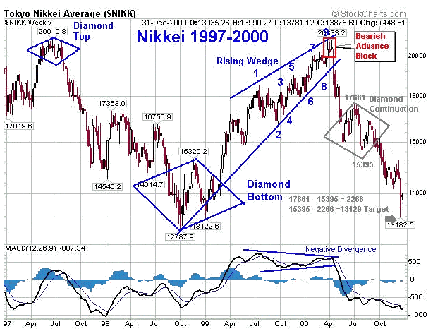
The part I like is the move from the low into the rising wedge, culminating in the bearish block. The numbers are to identify turns, not Elliott waves. Here is a chart of ......
To read the rest of the Weekly Report, visit An Occasional Letter From The Collection Agency and sign up to the 14 day free trial.
By Mick Phoenix
www.caletters.com
An Occasional Letter in association with Livecharts.co.uk
To contact Michael or discuss the letters topic E Mail mickp@livecharts.co.uk .
Copyright © 2008 by Mick Phoenix - All rights reserved.
Disclaimer: The above is a matter of opinion and is not intended as investment advice. Information and analysis above are derived from sources and utilizing methods believed reliable, but we cannot accept responsibility for any trading losses you may incur as a result of this analysis. Do your own due diligence.
Mick Phoenix Archive |
© 2005-2022 http://www.MarketOracle.co.uk - The Market Oracle is a FREE Daily Financial Markets Analysis & Forecasting online publication.