


8 Charts That Show How Insane the Economy Is Today
Economics / US Economy Nov 27, 2017 - 03:51 PM GMTBy: John_Mauldin

 Since the 2008 financial crisis, there’s been a growing number of ridiculous, inane, and otherwise nonsensical economic interventions from our central bankers that fill the daily economic headlines.
I have gone from the occasional smile to scratching my head now and then to "WTF" moments.
All that said, the economists who designed these interventions had their reasons. They thought lower interest rates and liquidity injections would create jobs, spur investment, and eventually produce inflation.
Then the idea was to reduce the stimulus before inflation got out of control. The problem is that none of these wishes came true.
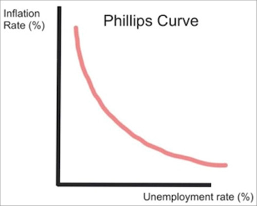
The Philips Curve That Doesn’t Work Anymore
The key gauge of central bankers for assessing this tricky process is the unemployment rate.
An economy at “full employment” is one in which inflation is right around the corner. The theoretical relationship looks something like this – chart from Gary Shilling.
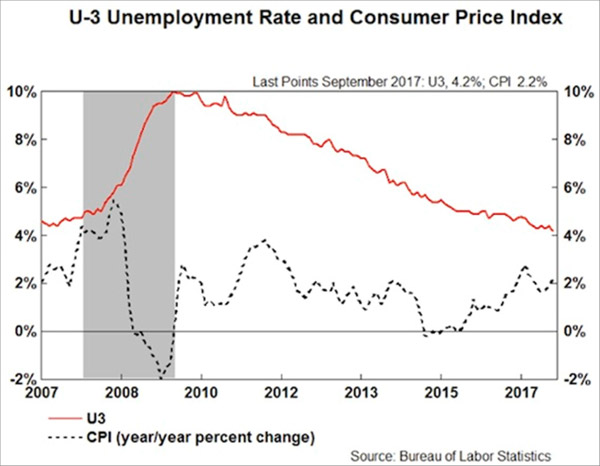
In fact, we now have very low unemployment, accompanied by stubbornly low inflation.
Why is that? No one really knows.
All sorts of theories are floating around, but none have yet proven helpful in restoring the Phillips Curve.
Here’s reality, via Gary Shilling:
The Median Household Is Back Where It Was in the 1990s
The result is a strange economy in which the people who want jobs mostly have them—but remain deeply dissatisfied, stressed, overleveraged, and often angry. See this graph of real median household income, from my friend Murat Koprulu.
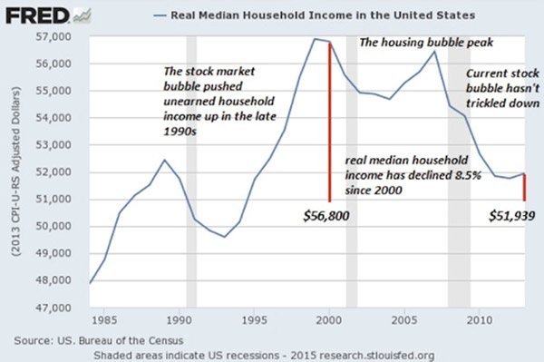
This is median, not average, household income. That means half of households are doing better and half worse. It’s also inflation-adjusted, so the amounts are consistent over time.
We see that the median family is roughly back where it was 20 years ago, in the mid-1990s. Worse, it’s still far below where it was ten years ago before the financial crisis. Is it any wonder people are mad?
Education Has Become a Risk Rather Than an Opportunity
One more absurdity.
In the US, we often think education is the key to getting ahead. That's not necessarily the case anymore. Here’s another chart Murat sent me, showing real average hourly wages by education level.
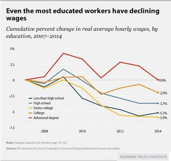
From 2007–2014, possessing an advanced degree enabled you to “get ahead” only in a relative sense. Your wages stayed flat while those of the less-educated fell.
Notice how having “some college” was actually more negative for wages than having only a high school education. How can that be?
Possibly because going to college without obtaining a degree leaves you in debt with less practical experience than your peers who went straight to work after high school.
To that point, student debt is quickly becoming a problem for everyone. Look at this chart from Grant Williams on student loan debt held by the federal government. Do we add that to our national debt?
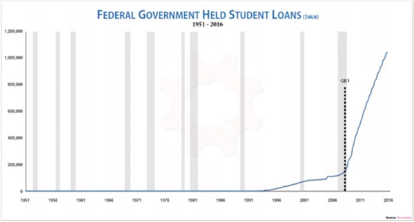
Taxpayers are on the hook for over a trillion dollars in student debt. Unlike mortgage or business debt, student debt is backed by no tangible asset you can repossess. It bought knowledge that now hopefully resides in the student’s brain, but it may have just gone in one ear and out the other.
That makes this debt uniquely risky. You and I are taking that risk, like it or not.
Stock Market Cap Is Near the Dot-Com Peak
And here’s another chart from Grant Williams, showing stock market capitalization to GDP. We are only another healthy bull market run away from being back to dot-com bubble levels. A run that many of my friends firmly believe awaits us.
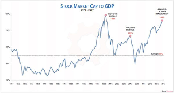
The US stock market as a percentage of GDP is now far bigger than it was at the housing bubble’s peak, and it’s rapidly approaching the dot-com bubble peak. That ought to make us a little nervous as we watch the Dow hit new all-time highs.
Insane Currency Pegs and the Global Market Driven by False Beliefs
And we will close this series of anomalies with a note I got from Louis Gave this morning. Rather than just looking for absurdities in the developed world, Louis’ research team at GaveKal scours the entire world in depth every day.
So he gives us a few lesser-known absurdities. [My comments will be in brackets.]
Usually currency pegs are not a bad place to start when looking for absurdities.
What are the odds of Lebanon keeping its peg now that Saudi won’t bankroll it? After all, you have a pegged currency with current account deficit in double digits relative to GDP:
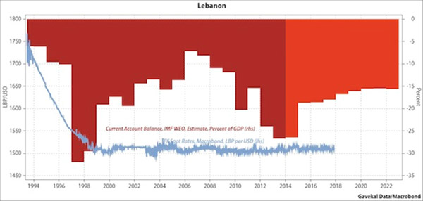
And once the Lebanese peg goes, will it be like Thailand in 1997 with Bahrein, Qatar, Oman, Egypt, Pakistan and ultimately Saudi all following suit?
If so, you can kiss goodbye to those large defense orders…
There are many other ideas. A lot of them linked to the craziness in the bond market (negative swiss yields, Italian junk below UST, etc…). But how about this one:
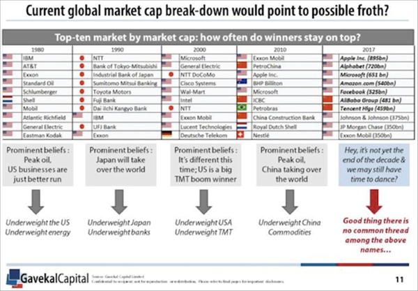
Okay, John back. Please note the serious level of sarcasm in the right-hand column above: “Good thing there is no common thread in the above names...” It’s all tech and all digital in the top seven. Note, however, that Exxon Mobil keeps hanging in there.
The above is why I love Louis and read his analysis every time I get a chance.
Get one of the world’s most widely read investment newsletters… free
Sharp macroeconomic analysis, big market calls, and shrewd predictions are all in a week’s work for visionary thinker and acclaimed financial expert John Mauldin. Since 2001, investors have turned to his Thoughts from the Frontline to be informed about what’s really going on in the economy. Join hundreds of thousands of readers, and get it free in your inbox every week.
John Mauldin Archive |
© 2005-2022 http://www.MarketOracle.co.uk - The Market Oracle is a FREE Daily Financial Markets Analysis & Forecasting online publication.