


The Men Who Stare at Charts: Decades of Disinflation & 7 Years Post-Op Twist
Commodities / Gold & Silver 2019 Jan 04, 2019 - 07:36 AM GMTBy: Gary_Tanashian

I was going to look around to see if I could find a media article out there (complete with a TA trying to sound really important) that would be appropriate to be made fun of in our little Men Who Stare at Charts series. But then I decided to create my own chart, stare at it a little, post it and talk about it (hopefully not too self-importantly).
Introducing an all too busy long-term (monthly) view of the Gold/Silver ratio, along with some key nominal markets.
The Continuum in the lower panel symbolizes the deflationary backbone that has been in place for decades. I maintain that this is a firm marker against which the Fed inflates money supplies, manipulates bonds and by extension manipulates inflation signals. We have been on a theme that like Jerome Powell or hate him, he knows exactly what he is doing because to do otherwise (promote ongoing bubbles on top of bubbles) would in essence end the Fed’s racket, as symbolized by a real breakout in long-term yields.
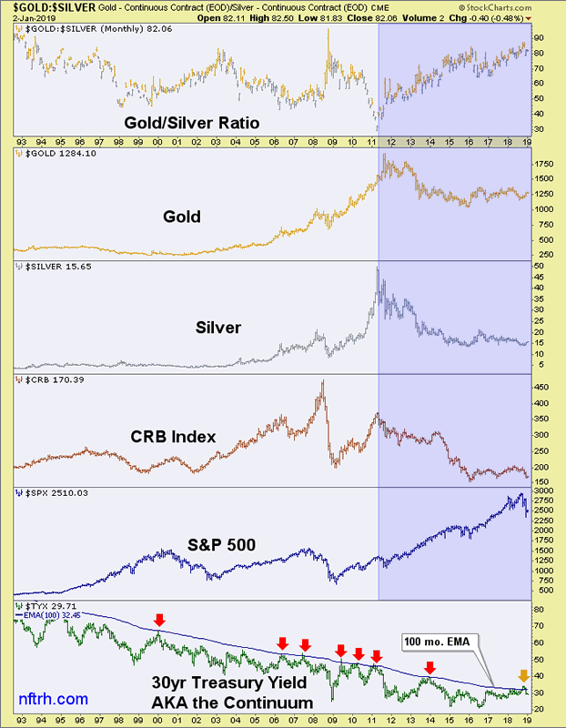
The blue shaded zone is a view of the most recent post-inflationary period, after Ben Bernanke killed macro inflation signals in 2011 as commodities (and silver) blew out and the ultimate in genius-like bond market manipulation, Operation Twist*, was inflicted on the macro. Voila! No inflation. It is by the way no coincidence whatsoever that there is a red arrow directly on top of that blow out in H1 2011. That was when the herd thought “silver to 100!” and Bill Gross shorted the long bond in anticipation of runaway inflation. No, Bernanke could not have that.
Instead we had a long phase of mostly Goldilocks style stock appreciation in the US while the Gold/Silver ratio rose in line with tight global liquidity and global markets under performed while commodities and precious metals got clobbered.
Last year, amid the now distant clarion calls of “BOND BEAR!!!” the yield broke above the continuum’s limiter (EMA 100) and it was no wonder at all (to us, anyway) why Powell was so stern. Ref. Treasury Bonds and the Fed from October 21, when long-term bond yields were still in breakout mode.
We remain in a deflationary phase against which the Fed would seek to be permitted (by the bond market) to inflate once again. Had the yield broken out amid rising stock prices and a booming economy pushing costs (and inflationary effects) the gig would have been up. Yet still people ask why Powell was so “out of touch” with reality. HE. WAS. NOT.
Watch silver vs. gold and then watch for changes to come. If the Gold/Silver ratio breaks down from its historical high region in 2019 you’ll know that a big inflation trade is brewing out of the current market stress. If it breaks out and stays out, nice to know ya, it would be panic mode for the Fed and likely a massive liquidation of asset markets for the rest of us.
Best for all involved that we continue along the Continuum, with the backbone holding firm once again amid some market and economic stress and prepare for the Fed to do its thing later on, in the way its thing has been done for decades now.
Of course, the line the Fed is walking seems to be getting thinner and thinner. With the Gold/Silver ratio so high already we can consider what kind of deflationary damage could be done with a big picture breakout. On the inflationary side, we can ask how long can the Continuum… continue before inflation (enter Ludwig von Mises’ Crack-up-Boom) gets out of control and decades of inflated chickens come home to roost?
That is what staring at the above chart says to me.
* The evil brilliance of Op/Twist was that it painted inflation signals out of the macro by the selling of short-term Treasuries and the buying of long-term Treasuries… and the market believed it and has run with it for 7+ years as evidenced by a chronically flattening yield curve.
Subscribe to NFTRH Premium (monthly at USD $33.50 or a 14% discounted yearly at USD $345.00) for an in-depth weekly market report, interim market updates and NFTRH+ chart and trade setup ideas, all archived/posted at the site and delivered to your inbox.
You can also keep up to date with plenty of actionable public content at NFTRH.com by using the email form on the right sidebar and get even more by joining our free eLetter. Or follow via Twitter ;@BiiwiiNFTRH, StockTwits or RSS. Also check out the quality market writers at Biiwii.com.
By Gary Tanashian
© 2018 Copyright Gary Tanashian - All Rights Reserved
Disclaimer: The above is a matter of opinion provided for general information purposes only and is not intended as investment advice. Information and analysis above are derived from sources and utilising methods believed to be reliable, but we cannot accept responsibility for any losses you may incur as a result of this analysis. Individuals should consult with their personal financial advisors.
Gary Tanashian Archive |
© 2005-2022 http://www.MarketOracle.co.uk - The Market Oracle is a FREE Daily Financial Markets Analysis & Forecasting online publication.