


Gold …Some Confirmations to Watch For
Commodities / Gold & Silver 2019 Mar 21, 2019 - 03:11 PM GMT

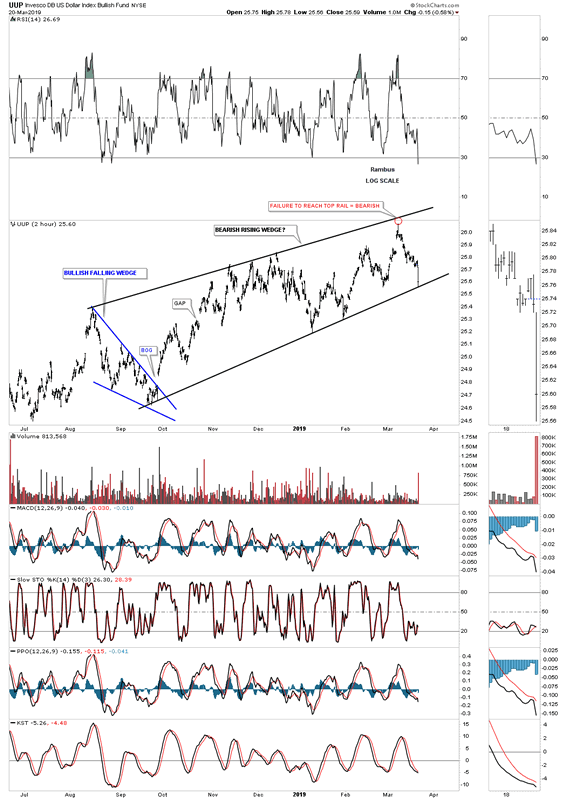
 With the UUP ( US Dollar ETF) having a fairly large decline today lets update a few charts to see how they’ve been progressing. Back in August of last year the UUP began to build out a rising wedge formation with today’s price action completing the fourth reversal point when the UUP traded down to the bottom trendline. Sometimes when a stock fails to touch the top rail in a well defined pattern like the rising wedge the UUP is showing, it can be a warning sign that the energy just isn’t there and the stock has run out of gas. To complete the rising wedge we need to see the bottom rail give way which should usher in a strong move for the PM complex and I would think commodities in general.
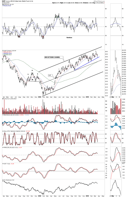
The last time I showed you this daily chart for the UUP I suggested there was something for both the bulls and bears alike. Since the February 2018 low the UUP has been building out a parallel uptrend channel which I labeled as a new uptrend channel. The UUP can correct all the way down to the bottom rail of the uptrend channel and still be in a bull market. It’s very hard to predict the future but one scenario I could envision is that while the UUP corrects within its 2018 uptrend channel the PM complex can experience a big move to the upside. Whenever the UUP comes into contact with the bottom rail of its uptrend channel that would be a good signal that the PM complex may need to consolidate its recent impulse move which I believe is just getting started. Something we can monitor.
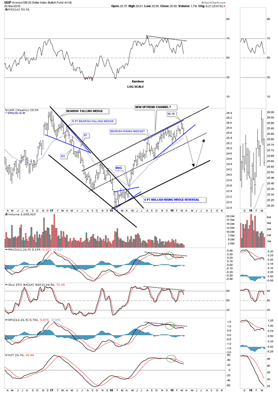
This weekly chart shows the previous two falling wedges which occurred during the last decline with the first one being the blue five point bearish falling wedge reversal pattern. The other falling wedge ended up being a one year bullish black falling wedge. Note the smaller blue five point bullish rising wedge reversal pattern that formed at the 2018 low. Needless to say the UUP likes to form wedges of all kinds.
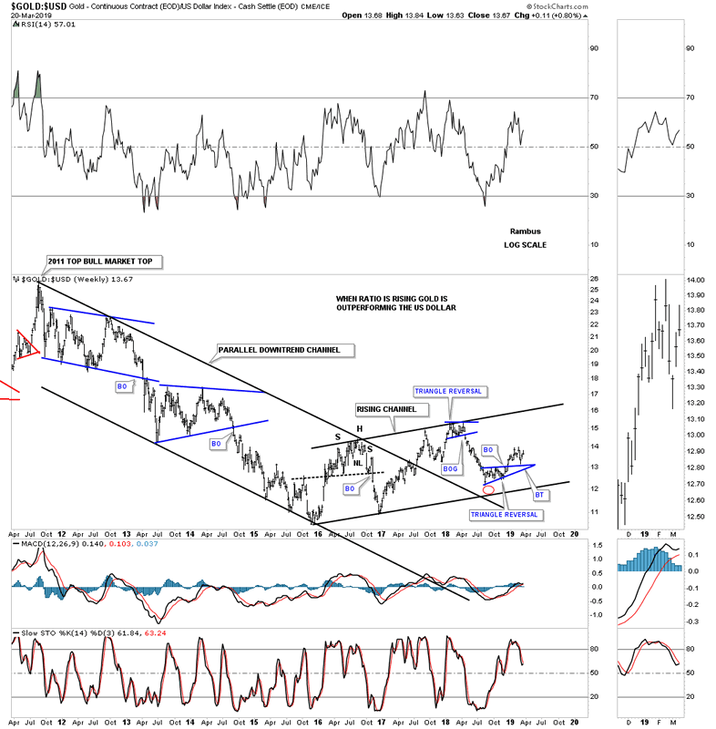
A couple of weeks ago we looked at this ratio chart which compares gold to the US dollar. At that time the ratio was backtesting the top rail of the small triangle reversal pattern near the bottom of the uptrend channel but failed to make it all the way down, red circle. Again, if the ratio can rally all the way up to the top rail of the rising channel the PM complex should have the wind at their backs.
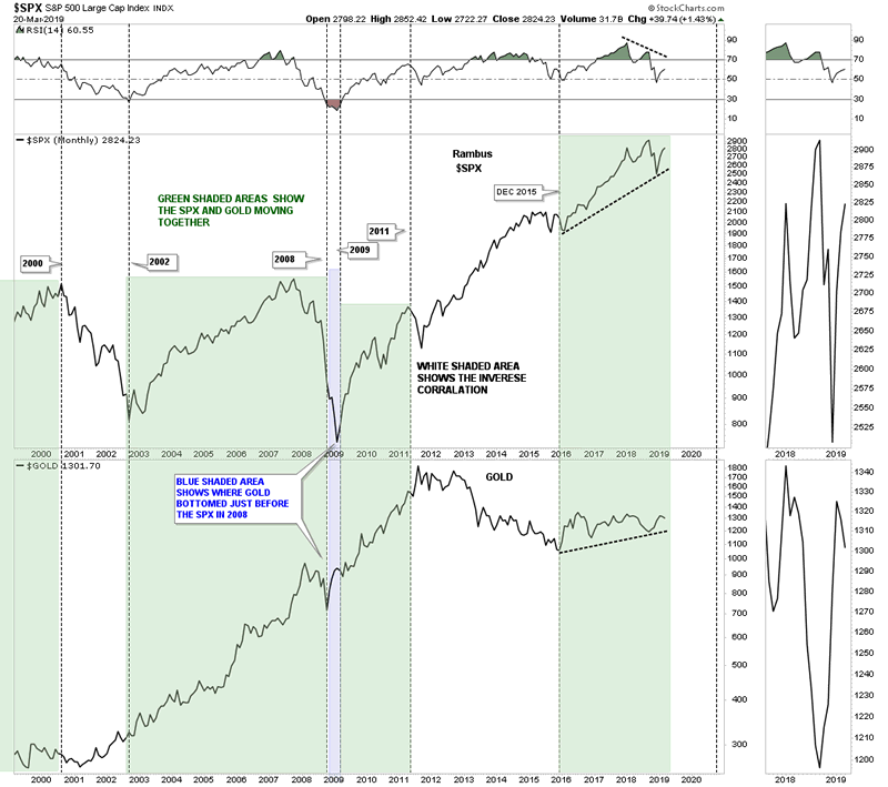
This next chart is a combo chart which has the SPX on top and GOLD on the bottom. A lot of investors have a misconception about the stock market and gold. Most gold investors believe the stock markets have to crash in order for gold to rally which happens sometimes as shown by the white shaded areas. On the other hand some of GOLD’s biggest rallies have come in tandem with the SPX green shaded areas. Since their 2016 lows the SPX has rallied much stronger than GOLD but gold has also been trending higher. No one knows 100% for sure what’s going to happen in the future but it wouldn’t hurt my feelings to see both the SPX and GOLD rally together like they have done many times before.
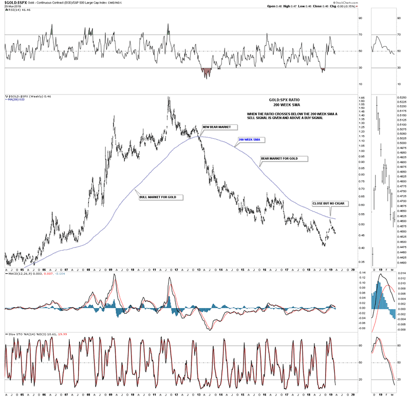
Below is a simple weekly ratio chart which compares GOLD to the SPX using the 200 week sma. As you can see there are not many buy and sell signals, but if you get one it pays to follow it for the longer term. Earlier this year the ratio got close to the 200 week sma but failed to breakout above it. Also keep in mind ratio charts can be a bit deceiving at times. For instance both gold and the SPX can rally at the same time, but if the SPX rallies more strongly than gold the ratio will fall. What this ratio is currently telling us is that the SPX has been outperforming gold since the first of the year.
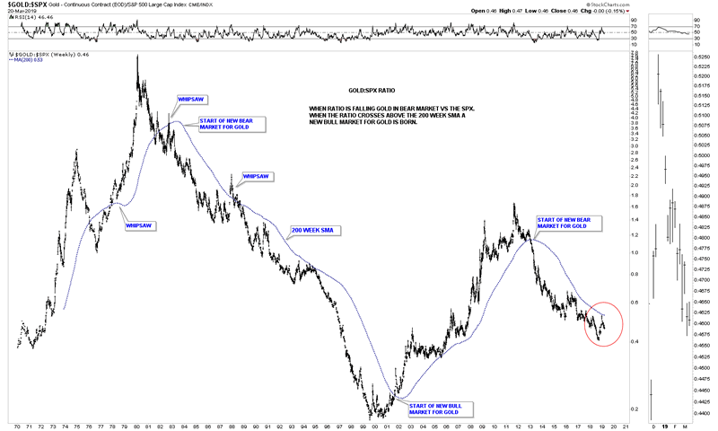
Below is a 50 year chart for the GOLD to SPX ratio using the 200 day sma for long term buy and sell signals. Again, you can see how well it works with very few buy and sell signals and only a few whipsaws over a 50 year period. There are two ways you can look at how the ratio interacts with the 200 week sma. First, when the ratio crosses above or below the 200 week sma you get a buy or sell signal. Also when the 200 week sma moves from a rising position to a falling position you can get a buy or sell signal. If you get whipsawed always go with what the price action and the 200 week sma are showing you what to do. You may get whipsawed for awhile but the price action and the 200 week sma will always show you the long term trend which is your friend. The next time the ratio crosses back above the 200 week sma we know it will be time for GOLD to outperform SPX for most likely a fairly long period of time.
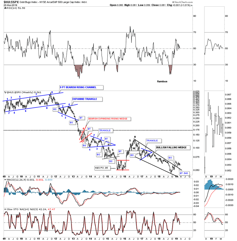
This next chart is a 10 year weekly ratio charts which compares the HUI to the SPX. In 2011 when the ratio completed the 9th reversal point in its multi year reversal pattern the SPX shed no sympathy on the HUI. This chart shows you a good example of what a bear market looks like with one consolidation pattern forming just below the previous one. Back in late 2015 it looked like the ratio was finally going to reverse direction when the red rectangle reversal pattern formed, but it wasn’t to be. Does the current 2016 falling wedge look familiar to you? That is the same one we are following on the PM stock indexes. This ratio may be seeing the light at the end of the tunnel and it may be time for the HUI to outperform the SPX for awhile. Remember they both can go up but if this ratio is rising the HUI is outperforming the SPX.
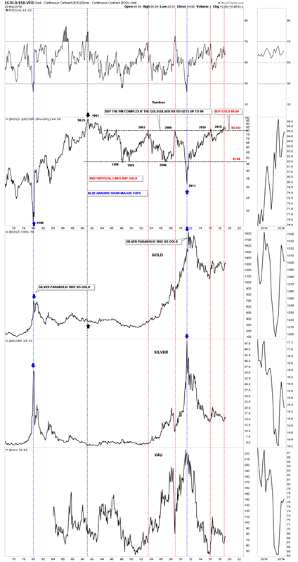
This last chart for tonight is another ratio chart going back 45 year which compares gold to silver. When the ratio is rising gold is outperforming silver. When the ratio trades above 80 that is a generally a good time for the precious metals complex as shown by the red dashed vertical lines. What we want to see is for the ratio to drop below 80 which would be another bit of confirmation the rally in the PM complex is alive and well.
We are seeing some signs that the PM complex is trying to bottom in this general area. To really get this beaten down sector back on its feet again I would like to see more confirmation take place on some of these ratio and moving average charts above. The bottom appears to be in place for the PM complex but it’s always nice to see confirming signals from different perspectives to add the frosting to the cake.
All the best
By Rambus Chartology
FREE TRIAL - http://rambus1.com/?page_id=10
© 2019 Copyright Rambus- All Rights Reserved
Disclaimer: The above is a matter of opinion provided for general information purposes only and is not intended as investment advice. Information and analysis above are derived from sources and utilising methods believed to be reliable, but we cannot accept responsibility for any losses you may incur as a result of this analysis. Individuals should consult with their personal financial advisors.
© 2005-2022 http://www.MarketOracle.co.uk - The Market Oracle is a FREE Daily Financial Markets Analysis & Forecasting online publication.