


Six Layers Of Deficits Mean Debt Retirement Disaster
Interest-Rates / US Debt Oct 21, 2011 - 01:54 AM GMTBy: Dan_Amerman

 There is a common but mistaken belief that the children and grandchildren of older Americans will be the ones who will be paying for today's massive government deficits. In this article we will look at six different layers of the deficit and unfunded government promises and put them into personal, per household terms in order to get to the truth of the matter. This truth is that the deficits are far too large to be repaid by taxpayers decades from now, but will be instead effectively repaid through the destruction of retiree savings and retirement investment portfolios in the coming years.
The value of your checking account, the value of your IRA or Keogh, and the value of all your investments are - and will be - the true source of payment for deficits. The end result could be a 95% reduction in value for all of our savings, retirement and otherwise, as we will illustrate step by step herein.
Layer 1: Annual US Government Deficit
The headline annual budget deficit for the United States government is about $1.3 trillion per year. This is our first layer, and it is a number that is so big that it becomes almost abstract. To better understand the very real and personal implications, we will express it in per household terms, and compare it to our household incomes.
According to the US Census bureau, there are about 113 million households in the US, of which about 16 million are below the poverty line. These 16 million households add to the deficit, they don't help pay for it, so that leaves about 97 million households above the poverty line whose taxes will be repaying government borrowing. On a per able-to-pay household basis, when we take $1.3 trillion, and divide by 97 million able-to-pay households, then each household's share of the government's annual borrowing is about $13,400, as shown in the graph below.
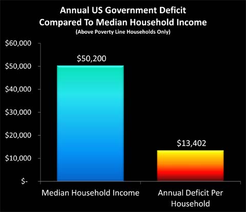
To keep a constant, personal comparison / reality check for the six layers of deficits, each graph has the same blue bar on the left, which is annual median household income of $50,200. The "fire" bar on the right is the particular deficit measure, which for layer one is the annual deficit of $13,402 per above poverty line household.
In other words, your share of the national "credit card" went up by about $13,400 in the last year, on top of whatever else was going on in your household. Your household - and 97 million others - essentially borrowed enough money to buy a new car just in the last year, albeit a quite basic subcompact.
This is a useful perspective when it comes to evaluating budgetary proposals. For instance, let's say someone wants to spend $500 billion in an attempt to improve the economy. Your share of this increased deficit spending comes to about $5,100. This means you are now borrowing enough to buy a 2nd car this year alone, albeit a five to ten year old used vehicle this time, on top of the new car equivalent you are borrowing with just the "normal" deficit. By itself, this doesn't answer the question about whether a $500 billion stimulus is worthwhile - that depends on whether you believe the stimulus will work or not - but it does remove the abstract nature of the question and make the very real and personal cost for each of us easy to evaluate.
Layer 2: Current US Government Debt Outstanding
Every able-to-pay household in the United States borrowing enough to buy a new car in the last year adds up to a whole lot of money - but it wasn't the first or only time that we took out a loan. Far from it, as the federal government has been incurring deficits much more often than not throughout our lifetimes, and deficit spending jumped up to the current fantastic levels of roughly a subcompact car per year about three years ago, when the financial crisis kicked fully into gear.
The total national debt outstanding is currently about $14.8 trillion. When we divide that by 97 million above poverty line households, then the government debt per household works out to a little over $152,000 per household, as shown below.
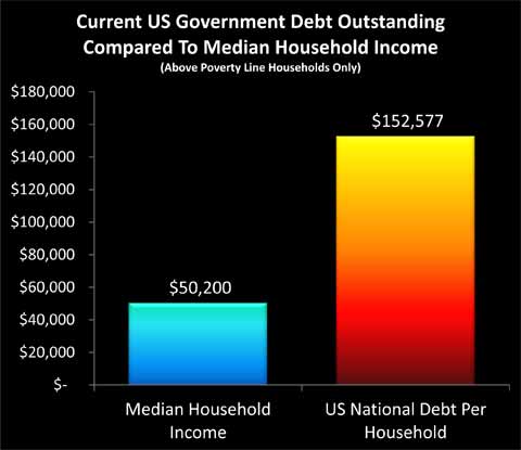
Forget a new car; we all already each owe enough to finance a second home equal to the value of our primary residence. The median value of a single family home in the US as of the first half of 2011 was $171,900 (per the National Association of Realtors), thus each of our households' share of the national debt is equivalent to having a mortgage outstanding at an 89% loan-to-value ratio on an average home.
So in addition to food, utilities, gas, health care payments, taxes and everything else, we also all have to make payments on a second house, even while we borrow enough to pay for a new car each consecutive year. Except that there is no actual house or annual new car to add to the line-up in the driveway, just an insatiable federal government.
Layer 3: US Govt Debt Outstanding In 10 Years
Buying a new car every year - while still making payments on the new cars from each previous year - would seem to be a good way to get in much worse shape and very quickly. If we keep this up - how much trouble will each of our households be in ten years from now?
There are a couple ways of approaching this question. The easy way is political gamesmanship, and making all kinds of assumptions about the future that make the numbers look good, so the politicians can justify the actions they want to take today. The bottom line is that the politicians, wonks and pundits all assume that future politicians will be braver and more disciplined than the current politicians, and will fearlessly make the changes in terms of slashing benefits that today's politicians refuse to do. The government also makes ever freer use of accounting gimmicks / deceptions, which is why the current deficit is reported as "only" $1.3 trillion.
Of even more importance to the projections used by the government is the assumption that economic growth gets right back on track, unemployment plummets, and tax revenues surge over time. Even with these optimistic economic projections, but absent major tax increases or much larger benefits reductions than those proposed in the latest rounds of agreements, the deficit continues right along at about $1.3 trillion per year over the next ten years. So the baseline optimism scenario translates to borrowing the money each year to buy yet another car.
Another way is to take a reality-based approach, and say that the Boomers are aging fast and the economy isn't performing. There are about 77 million Boomers, with an average of another 4 million reaching retirement age each year. Absent major structural cures (i.e. slashing entitlement benefits), the cost of making Social Security and Medicare payments to a rapidly growing retirement age population will create a spiking expense structure for the government.
If we don't assume that this whole unemployment / economic malaise thing goes away, then there won't be the soaring tax revenues that the politicians' economic projections rely upon. This means both higher expenses and lower tax revenues, which then produce a radically higher annual deficit that gets much worse each year. How bad the deficit gets depends on both the economy and politics, but each of our households borrowing enough money to buy an SUV once a year and every year over the next 10 years (on average) is within the range of possibilities.
Each of our households borrowing enough money each and every year to buy another SUV sounds borderline insane, and exploring this subject is depressing enough without adding economic and political pessimism to the mix. So, we will make the optimistic assumption that the deficit stays the same as it is today at about $1.3 trillion per year, or about $13,400 per household. In other words, we'll assume that the economy ends up getting fixed, and politicians set aside partisanship and personal ambitions to do what is right for the nation, making most of the tough choices on both taxes and entitlements that are needed to solve the soaring entitlements problem.
Ten years of deficits at $1.3 trillion per year is $13 trillion in total new deficits. Add that to the $14.8 trillion outstanding today, divide by 97 million above poverty line households, and we get about $286,000 per household, as shown in this next graph.
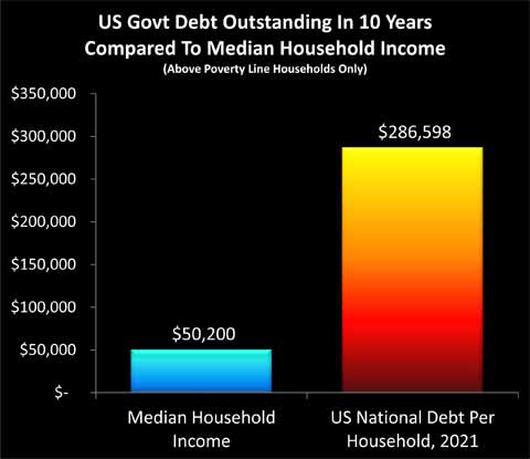
If we take the mortgage we are obligated to pay for today (Layer 3), and add in ten years of annual new subcompact car purchases, then we each end up owing the equivalent of almost two additional mortgages per household in ten years. With the optimistic assumptions about the economy and responsible behavior by politicians, that is.
Layer 4: Total Unfunded Federal Govt Obligations
There are two issues with our "Layer 3" approach of simply carrying forward current deficits into the indefinite future. The first problem is that the retirement entitlement crisis will be growing much worse, because of the simple reality of an aging population. The greater the number of retirees, then the higher the proportion of the population collecting benefits, and the lower the proportion of the population that is working and paying taxes to fund those benefits. Projections are that by the year 2027 the US will be down to two people working for every one person of retirement age, and therefore the 2020s and beyond are likely to produce much greater deficits than what we are seeing in the early 2010s.
The other problem is that deficits are based on governmental accounting, and there is a very different set of rules than the more familiar accounting used by corporations. When a corporation makes a contractual promise to pay in the future, the cost is included today - but when a government makes extraordinarily expensive promises for unfunded future benefit payments, the shortfall is ignored in current deficits.
Government accounting is also subject to numerous levels of manipulation, with most of the purported "benefits" of the last two rounds of deficit "reductions" consisting of loopholes in government accounting standards, with no corresponding real world savings. When 2011 is now officially reported as a $1.3 trillion deficit rather than $1.5 or $1.6 trillion, it is because of the manipulation of loopholes within the bizarre and politically influenced world of governmental accounting.
When we include the rapidly rising health care and Social Security costs of an aging population, and we take the private sector approach of actually including the costs to pay for promises that have been made by politicians - without the funding to pay for them - then a much worse picture of future deficits appears. There are estimates in the $100 to $200 trillion range that have been widely circulated. Those would be too depressing, however, so we are going to use some more optimistic assumptions.
According to a 2011 study by USA Today, total unfunded obligations of the United States federal government are approximately $62 trillion.
When we take $62 trillion in total unfunded federal government obligations, and divide by 97 million above poverty line households, then the total comes to just shy of $640,000 per household, as shown in the graph. This means that each of us is obligated to pay the equivalent of four additional mortgages over the coming decades, over and above our real mortgage and all our other costs and obligations.
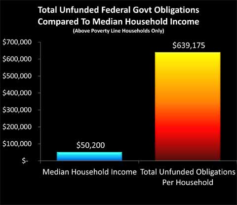
One of the most difficult things to emotionally or intellectually accept about these numbers is that they are the "good" projections. These numbers sound so depressing, that our natural emotional response may be to write them off as just more "gloom 'n doom", and walk away, hoping that things will turn out better. But these aren't pessimistic or from the fringe, rather, the $640,000 per household assumes a healthy economy, and that the government will somehow find methods to deeply slash the rate of growth in medical expenses in the coming years.
Layer 5: Annual Growth In Federal Obligations
Let's return to where we began, and take another look at the annual deficit per able-to-pay household. This time, however, we will step outside the deliberately distorted and bizarre world of government accounting, and simply look at the deficit in the same way that we would for an individual or private corporation.
Per the USA Today study referenced earlier, the annual growth in unfunded federal government obligations was $5.3 trillion in 2010. If we divide $5.3 trillion by 97 million above poverty line households, then the annual growth in the real deficit was almost $55,000. This number is larger than the median household income. Indeed, the annual real deficit in the United States is 109% of median household income.
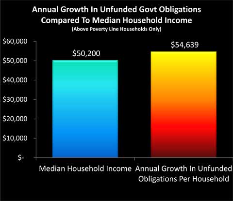
The bottom line is surreal, but it is not difficult to understand or document - just do the simple math. Take the annual growth in unfunded obligations as reported by a major national newspaper. Divide by the number of above poverty line households in the United States, as reported by the Census Bureau. Compare to the median household income, as reported by the Census Bureau
When compared to the average household, the annual growth in the per household share of unfunded government obligations is indeed equal to 109% of the gross income of that household.
And once again, this is one of the "good" scenarios.
Total Obligations Per Non-Retired Household (Layer 6), Your Personal Reality Check, Covering The Gap, History & Retirees
The second half of this article can be read at the link below. Highlights include: 1) the personal implications when we remove the assumption of retirees paying the taxes that pay for their own benefits; 2) the seeming impossibility of the results; 3) what will likely happen in practice instead; and 4) the damage for retirement investors and necessary changes in approach.
By Daniel R. Amerman, CFA
Website: http://danielamerman.com/
E-mail: mail@the-great-retirement-experiment.com
Daniel R. Amerman, Chartered Financial Analyst with MBA and BSBA degrees in finance, is a former investment banker who developed sophisticated new financial products for institutional investors (in the 1980s), and was the author of McGraw-Hill's lead reference book on mortgage derivatives in the mid-1990s. An outspoken critic of the conventional wisdom about long-term investing and retirement planning, Mr. Amerman has spent more than a decade creating a radically different set of individual investor solutions designed to prosper in an environment of economic turmoil, broken government promises, repressive government taxation and collapsing conventional retirement portfolios
© 2011 Copyright Dan Amerman - All Rights Reserved
Disclaimer: This article contains the ideas and opinions of the author. It is a conceptual exploration of financial and general economic principles. As with any financial discussion of the future, there cannot be any absolute certainty. What this article does not contain is specific investment, legal, tax or any other form of professional advice. If specific advice is needed, it should be sought from an appropriate professional. Any liability, responsibility or warranty for the results of the application of principles contained in the article, website, readings, videos, DVDs, books and related materials, either directly or indirectly, are expressly disclaimed by the author.
© 2005-2022 http://www.MarketOracle.co.uk - The Market Oracle is a FREE Daily Financial Markets Analysis & Forecasting online publication.