


US Dollar Index Huge Consolidation Pattern
Currencies / US Dollar Jun 15, 2014 - 03:09 PM GMTBy: Austin_Galt

 The title says it all really. Let’s first look at the yearly chart of the US Dollar Index to see what it means.
YEARLY CHART
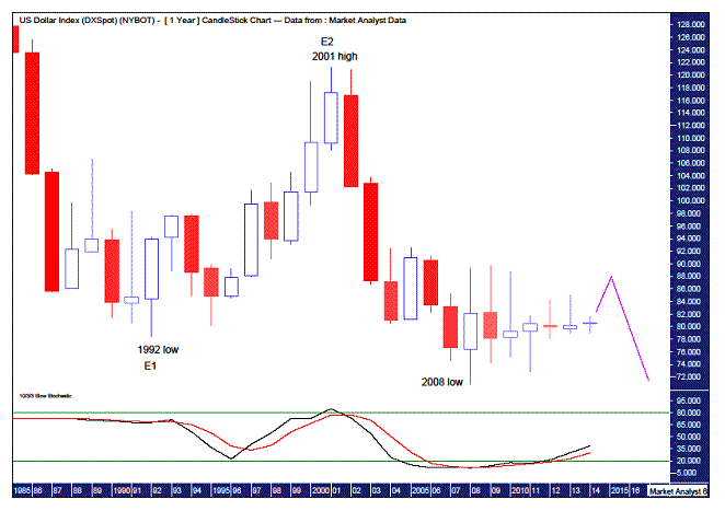
The first thing that stands out here is the pattern of lower lows and lower highs – a bear trend. Now this chart goes back nearly 30 years so this really is a fair dinkum bear market. Now look at the first three red candles on the chart. That was a fast and furious downmove. Very impulsive. From the 1992 low it took around 9 years to claw back most of the fall. But then after the 2001 high price was pretty much back to where it started just 3 years later. This is a key identifier of what the trend is – in this case, a negative one.
The next major low occurred in 2008 which was a new low. So, what has happened since then? Despite all the hooting and hollering of the megabears, price has pretty much done naught. An achievement in itself!
So what is likely to happen going forward? Well, I have added a Stochastic Indicator which, while being in weak territory, is trending up. So perhaps we could surmise that price can push a bit higher this year and into 2015. However, let’s not kid ourselves. The price action since the 2008 low has been extremely weak and a resumption of the bear trend can’t be too far off. Just keep in mind this is the yearly chart. So for all those daily chart fans, there is no need to get your knickers in a knot if price doesn’t start tanking next week!
I’ve also added a couple of Elliott Wave annotations which gives it some structure. These include denoting the 1992 low as E1, the end of the first wave. And then denoting the 2001 high as E2, the end of the corrective second wave. (Keep in mind the all time high is around 165 and is not shown on the chart.) That means the impulsive Wave 3 is currently underway. So what we have seen since the 2001 high is just the beginning of a monumental move down. And the worst is yet to come. Other countries may not want to bank on an influx of American tourists in the future as the United States is on its way to the poor house. Then again, with its military might it is still king of the world so it can always change the rules if it wants.
MONTHLY CHART
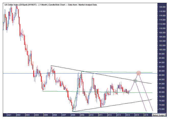
Now there are quite a few lines on this monthly chart which I hope doesn’t clutter things up too much. Personally, I can’t stand looking at charts that have lines zig-zagging all over the place so that I need binoculars just to get a glimpse at the price action. So let’s work through what exactly all these lines refer to.
Firstly, I have drawn an Andrew’s Pitchfork which is denoted by the three parallel green lines. This formation has easily held the price action as it consolidates. A break of the pitchfork would surely be a sign of what direction the next significant move will be.
I have also drawn black trend lines across both the highs and lows. Most technical analysts will have these lines on their charts. I find them useful in highlighting the obvious setup so that I can then look for alternative setups. And what is the obvious setup? Price heads up to meet the downtrending line and turns back down. This area can be seen in the small green circle. And what is the alternative? That price breaks to the upside. This break will flush out the amateurs that focus too heavily on the obvious setup.
Now that the crowd is flummoxed, we could expect a turning point is close at hand. I have drawn a horizontal blue line at the June 2010 top level of 88.80. Price could well top out here as seen in the larger red circle. Another possibility is the top pitchfork level which stems from the March 2009 top level of 89.71. A top at either of these locations would also set up a double top with the trend. Just to put the wind behind the sails of the bears. A breakout above the 2009 high would most likely mean the bulls have won the battle. Unlikely for mine.
WEEKLY CHART
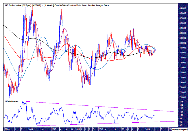
Here is a rare occasion in which I’m happy to show a confusing chart. Because that is the exact picture I want to convey. We don’t need to see the price bars. They are irrelevant. I have added 14, 50, 100 and 200 period moving averages and they can be seen criss-crossing each other all over the place. This is consistent with periods of consolidation. And when we see all the lines this close to each other it means sooner rather than later a big move in one direction is set to occur. And this is the weekly chart and it’s been like this for over 4 years. A huge consolidation. Tick tock.
I’ve also added a Momentum Indicator. I normally use this indicator in order to analyse how tired a bull or bear market is. However, this time I’ve drawn both a downtrending line across the tops and an uptrending line along the bottoms. So what does that mean? That folks, means this whole darn consolidation pattern is running out of puff! Tick tock.
That about wraps it up. I’m getting shivers up my spine just thinking about what lies ahead. Perhaps time for a lie down.
Bio
I have studied charts for over 20 years and currently am a private trader. Several years ago I worked as a licensed advisor with a well known Australian stock broker. While there was an abundance of fundamental analysts there seemed to be a dearth of technical analysts, at least ones that had a reasonable idea of things. So my aim here is to provide my view of technical analysis that is both intriguing and misunderstood by many. I like to refer to it as the black magic of stock market analysis.
Please register your interest in my website coming soon. Any questions or suggestions, please contact austingalt@hotmail.com
© 2014 Copyright Austin Galt - All Rights Reserved
Disclaimer: The above is a matter of opinion provided for general information purposes only and is not intended as investment advice. Information and analysis above are derived from sources and utilising methods believed to be reliable, but we cannot accept responsibility for any losses you may incur as a result of this analysis. Individuals should consult with their personal financial advisors.
© 2005-2022 http://www.MarketOracle.co.uk - The Market Oracle is a FREE Daily Financial Markets Analysis & Forecasting online publication.